Instagram has updated its iPad app to closely mirror the iPhone experience, abandoning the Reels-first interface it introduced when the native tablet version finally arrived last fall. The change comes more than 15 years after the iPad’s debut, closing a long chapter of awkward workarounds and browser-based access for users who wanted the social platform on a larger screen.
When the dedicated iPad app launched in late 2025, Instagram opted for a different approach. Instead of the familiar vertical feed of photos and videos from accounts users follow, the app opened directly into a full-screen Reels presentation. Stories appeared at the top, messaging sat one tap away, and the design emphasized “lean-back entertainment” suited to bigger displays. The intent was understandable—tablets often serve more passive viewing—but it quickly felt like a miscalculation. Many users simply wanted the core Instagram feed they knew from their phones, scaled up, rather than a format built primarily for short-form video discovery.
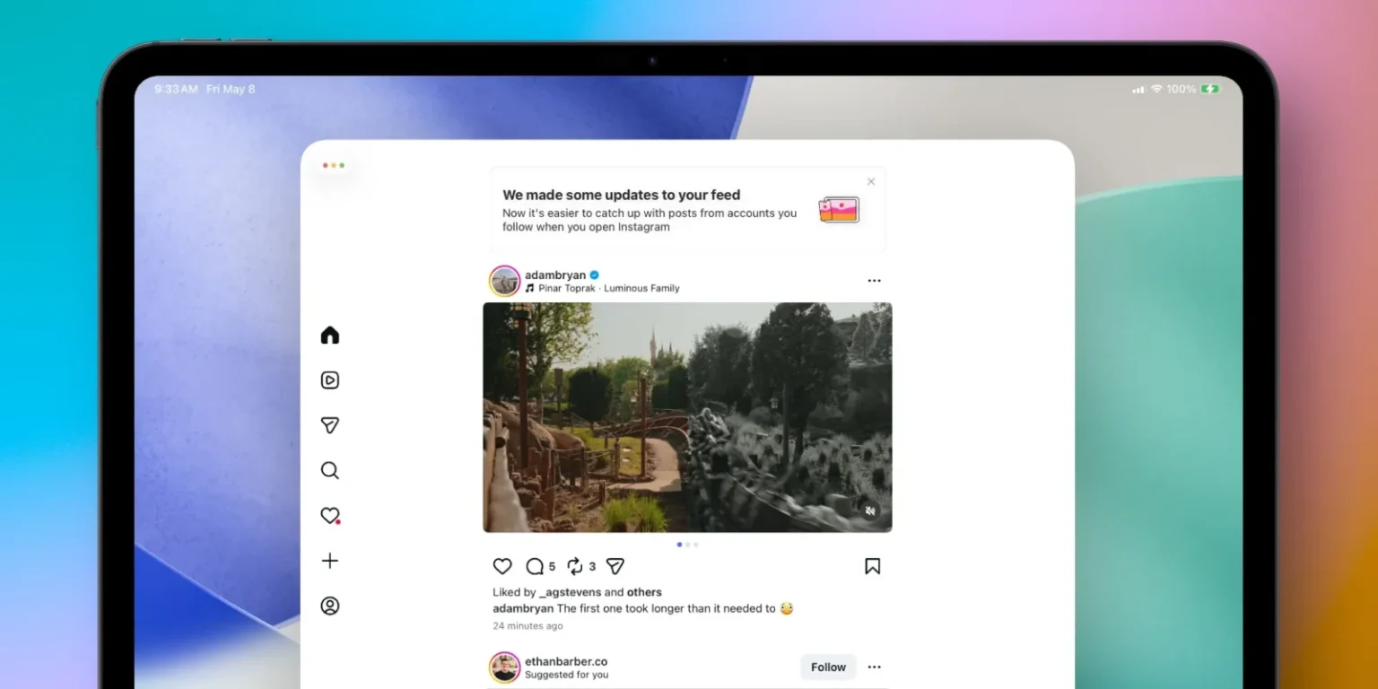
The latest update reverses that experiment. The Home tab now behaves like its iPhone counterpart, showing a chronological-style feed of posts from followed accounts mixed with algorithmic suggestions. Reels occupy their own dedicated navigation tab, consistent with the phone layout. The previous iPad-only “Following” tab, which essentially duplicated the Home experience under a different name, has been removed to reduce confusion. The result is a more unified Instagram across devices, with the primary advantage being the extra screen real estate for viewing images, carousels, and videos without the cramped constraints of a smartphone.
This course correction highlights a broader tension in how social platforms adapt to tablets. For years, Instagram treated the iPad as an afterthought, forcing users into suboptimal web versions or stretched phone apps. The initial Reels-centric redesign suggested the company viewed larger screens mainly as venues for passive consumption rather than active social browsing. Yet feedback apparently showed that most people still approach Instagram on iPad the same way they do on iPhone: checking updates from friends, scrolling through photos, and occasionally diving into Reels.
The shift brings welcome consistency, though it also underscores missed opportunities. A native iPad app could have explored thoughtful tablet-specific features—such as better multi-column layouts, easier side-by-side viewing of profiles and feeds, or enhanced creative tools for posting. Instead, the app remains largely a blown-up phone interface. While functional, it feels like a pragmatic retreat rather than a forward-looking redesign.
For users who have long wanted reliable Instagram access on their iPads without compromises, the update delivers a sensible, if belated, improvement. It prioritizes familiarity over experimentation, which in this case appears to align better with actual behavior. Whether this leads to deeper tablet optimizations in future versions remains to be seen, but at least the core experience no longer fights against user expectations.