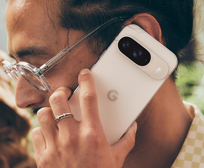
Google is reportedly experimenting with a fresh look for incoming calls on Android, and it bears a striking resemblance to the familiar two-button layout found on iPhones. This potential change, currently in the testing phase, has been unearthed within the latest version of the Google Phone app.
The new UI ditches the existing swipe-to-answer or swipe-to-decline mechanism for a more straightforward approach: a red “Decline” button on the left and a green “Accept” button on the right. This mirrors the layout Apple has long used for its iOS devices, potentially simplifying call management for Android users.

While some Android manufacturers, like Samsung, already utilize a two-button system, their button placement differs from both the iOS standard and the new Google design. This suggests Google is drawing inspiration directly from Apple,a move that may raise eyebrows among Android purists.
It’s worth noting that Google has yet to officially confirm this change, indicating it’s still in the experimental stage. This leaves room for user feedback to shape the final design, potentially influencing how Android phones handle incoming calls in the future.
Although seemingly minor, such UI tweaks can significantly impact the overall user experience. As Google continues to refine its Android ecosystem, it will be interesting to see if this iOS-inspired design becomes the new standard for Android phone calls.


