Netflix is shaking things up with a bold redesign of its TV app homepage. Say goodbye to static tiles and hello to dynamic boxes that expand with a simple hover, giving you a closer look at the shows and movies that catch your eye.
This change is all about making your viewing experience smoother and more intuitive. “We often see members doing gymnastics with their eyes as they’re scanning the home experience,” explains Pat Flemming, Netflix’s senior director of product. The new design consolidates information, making it easier to decide if a title is right for you.
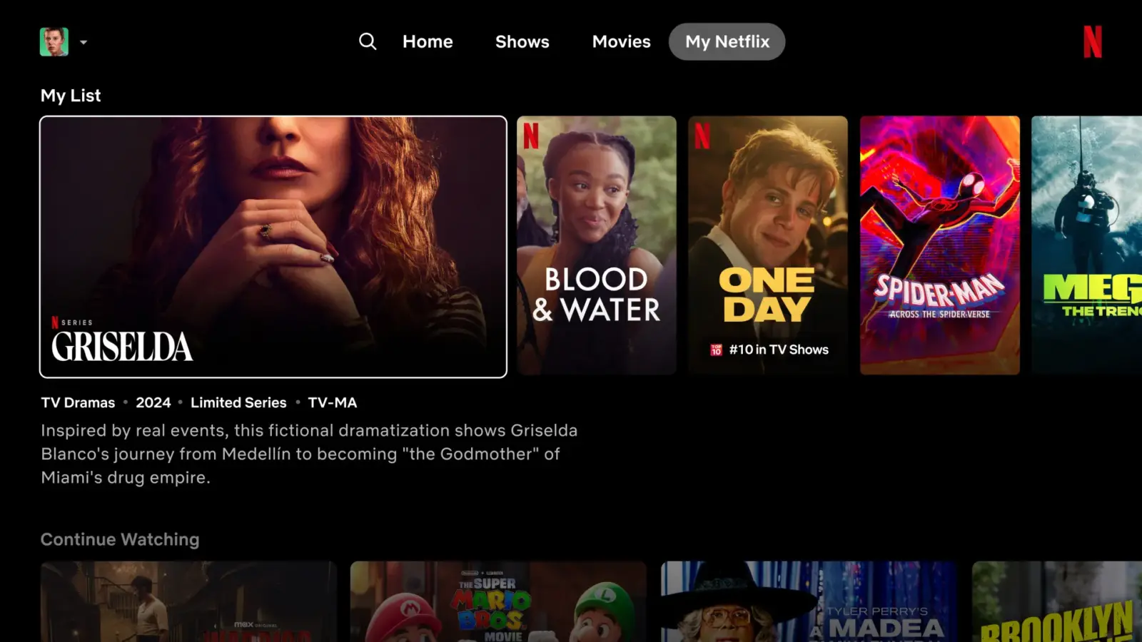
Hovering over a title now triggers a short preview within the tile itself, while the synopsis, release year, episode count,and genre are displayed prominently below. No more scrolling to the top of the screen to watch trailers!
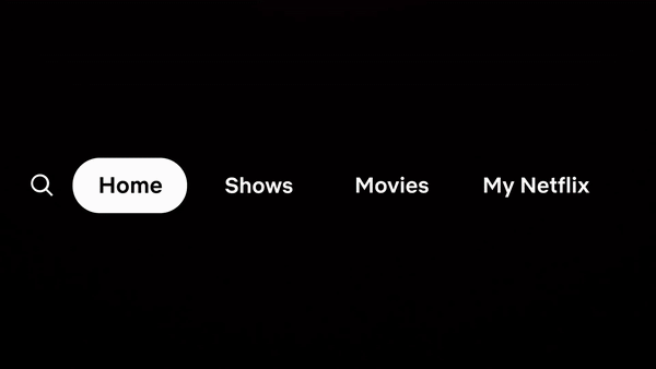
The traditional left-side menu is also getting a makeover. It’s been replaced with a sleek bar at the top, offering quick access to search, home, shows, movies, and the new My Netflix tab – a personalized space for recommendations and recently watched or saved titles.
Flemming describes this refresh as “a first effort” in enhancing the TV experience, and it’s easy to see how this update already feels like a major leap forward. With Netflix venturing into live events like fights and sports, the new design seems perfectly suited to navigate this expanding content landscape.
The new homepage is currently being tested with a small group of subscribers using smart TVs and streaming devices. If all goes well, Netflix plans to extend this exciting update to a wider audience in the coming months and quarters.
Get ready for a more immersive and engaging Netflix experience on your TV!