
Google Maps, the go-to navigation app for millions around the world, is undergoing a subtle yet impactful transformation.The iconic teardrop-shaped pin, a staple of the app’s visual language for years, is being retired in favor of a more modern and streamlined design.
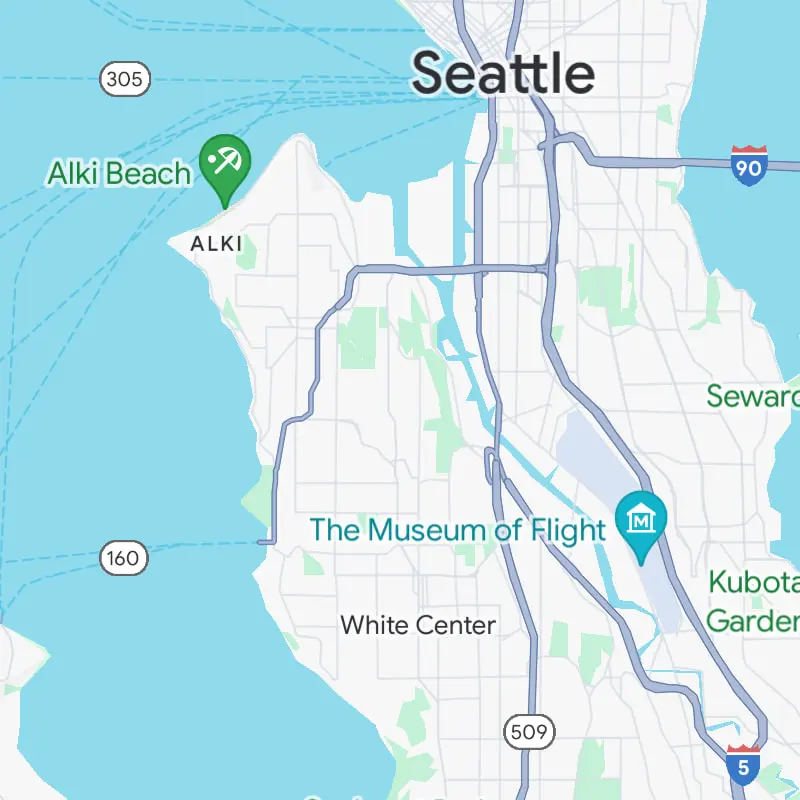
The new pin, shorter and rounder than its predecessor, features a clean white background with a colored inner circle that houses the category icon. This design change aligns the pin with the existing aesthetic of other icons within the app, such as stars, flags, and hearts, creating a more cohesive and visually pleasing experience.
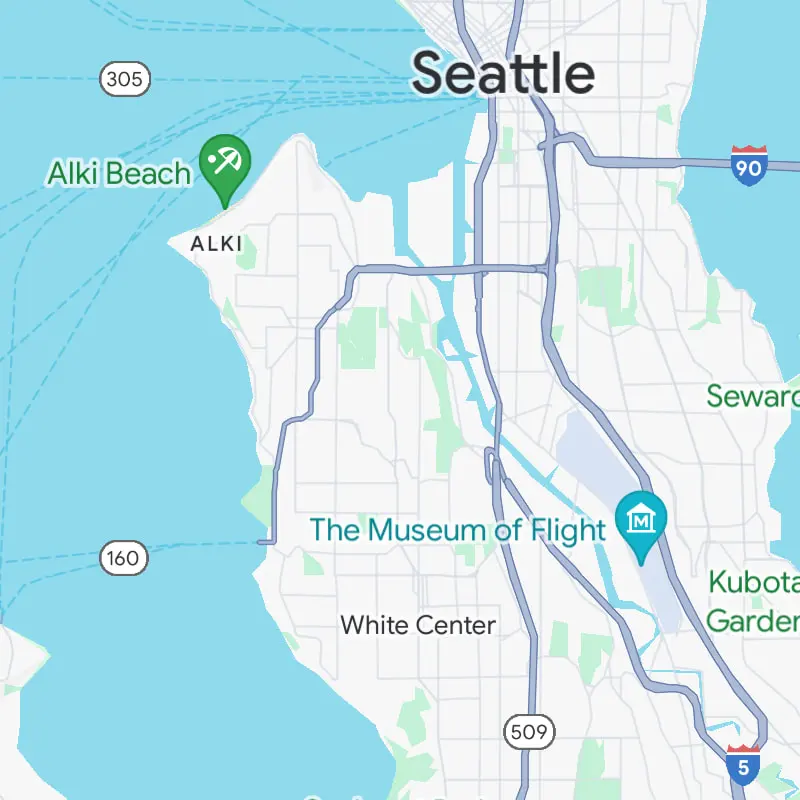
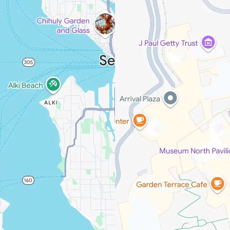
While the shape and overall look of the pins have been updated, most categories retain their familiar colors. However,some categories, like museums, have been assigned new hues, adding a touch of freshness to the map. Additionally, the redesign includes subtle tweaks to other colors and text elements, making them appear lighter and more contemporary.
This seemingly minor change could have a significant impact on the user experience. The shorter pin design might allow Google to display more pins on the map at once without causing visual clutter, especially in densely populated areas. This would make it easier for users to quickly identify and navigate to their desired destinations.
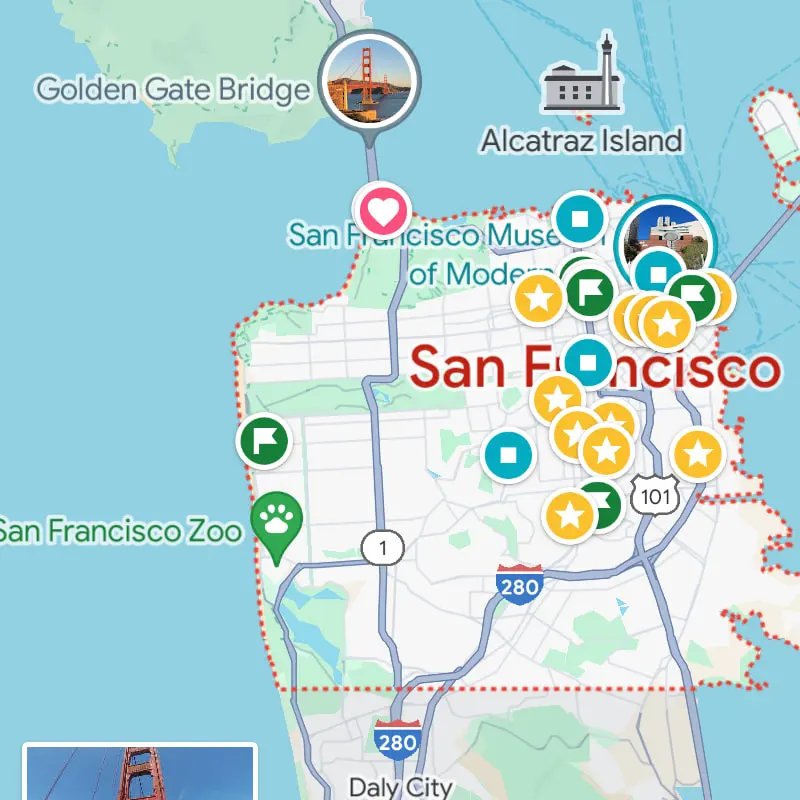

The redesigned pins are currently being rolled out to Android, iOS, and web users, so you may start noticing the new look in your Google Maps app soon. While some may mourn the loss of the classic pin, this update is a testament to Google’s commitment to continually refining and improving its products, ensuring that Google Maps remains the most user-friendly and visually appealing navigation tool available.