
• Stories
    • Tech
    • Auto
    • Guides
    • Opinions
  • Reviews
    • READERS’ CHOICE
    • ALL REVIEWS
    • ━
    • SMARTPHONES
    • CARS
    • HEADPHONES
    • ACCESSORIES
    • LAPTOPS
    • TABLETS
    • WEARABLES
    • SPEAKERS
    • APPS
  • Entertainment
    • TV & MOVIE REVIEWS
    • SPOTLIGHT
  • GAMING
    • GAMING NEWS
    • GAME REVIEWS
  • m
Reading: Google updates its iconic “G” logo with brighter colors and gradients
Font ResizerAa
Font ResizerAa
  • menu
  • SEARCH
  • STORIES
    • TECH
    • AUTOMOTIVE
    • GUIDES
    • OPINIONS
  • REVIEWS
    • READERS’ CHOICE
    • ALL REVIEWS
    • ━
    • SMARTPHONES
    • CARS
    • HEADPHONES
    • ACCESSORIES
    • LAPTOPS
    • TABLETS
    • WEARABLES
    • SPEAKERS
    • APPS
  • Entertainment
    • TV & MOVIE REVIEWS
    • SPOTLIGHT
  • GAMING
    • GAMING NEWS
    • GAME REVIEWS
  • m
Follow US

Google updates its iconic “G” logo with brighter colors and gradients

GEEK DESK
GEEK DESK
Sep 30, 2025

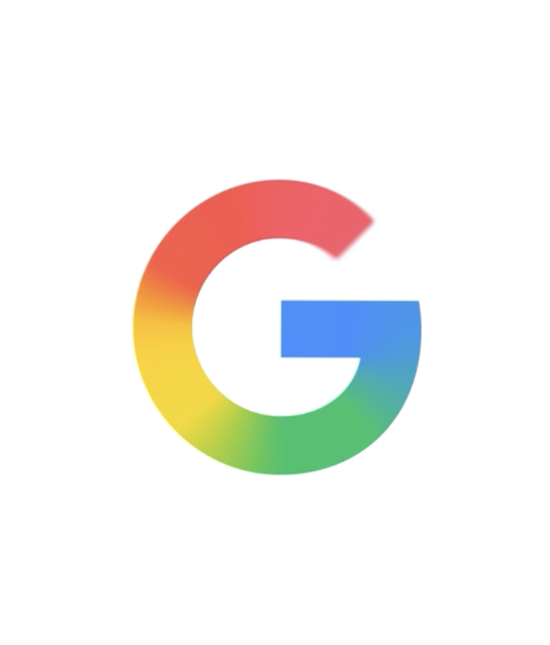
Google is giving its familiar “G” logo a fresh update, expanding the brighter, four-color gradient design it introduced earlier this year for Search to now serve as the company-wide symbol. The move marks the first major adjustment to Google’s primary icon since 2015, when the current four-color “G” was introduced alongside a broader logo redesign.

The new version retains the recognizable blue, red, yellow, and green palette but shifts toward more vivid tones with a subtle gradient. According to Google, the change is meant to capture the company’s ongoing shift in focus toward artificial intelligence while maintaining continuity with its established visual identity. The design first appeared with Gemini, Google’s AI suite, in June and will gradually be rolled out across products, apps, and services in the coming months.

Corporate logo updates tend to invite scrutiny, especially for brands as ubiquitous as Google. The company is framing this iteration not as a break from tradition but as an evolution — a way to modernize its appearance while acknowledging how central AI has become to its business. By leaning on gradients and brighter hues, the updated icon aims to feel more dynamic and in step with the visual styles that dominate tech branding in 2025.

Whether users notice the change beyond its initial rollout is another question. Google’s visual refreshes have historically been subtle, with continuity playing a central role in maintaining familiarity across billions of users and devices. But even small adjustments can be significant for a company that uses its logo as a constant presence across hardware, software, and services worldwide.

What do you think?
Happy0
Sad0
Love0
Surprise0
Cry0
Angry0
Dead0
A new Disney+ app is coming to MENA, and it’s more than just a redesign
Luna Band skips subscriptions and makes personalisation its focus
Best Sony back-to-school: four upgrades for studying, gaming and campus life
UGREEN enters AI smart homes with HomeAgent and wild MagFlow cooling
Google is giving UAE university students Gemini AI free for year
OpenAI launches GPT-6 Astra, and its benchmark scores look absurd
Follow US
Caffeine. Chaos. Content.
© Absolute Geeks Media FZE LLC 2014–2026.
Proudly made in Dubai, UAE ❤️
Contact · About · Editorial Policy · Privacy Policy
Welcome Back!

Sign in to your account

Username or Email Address
Password

Lost your password?