

• Stories
    • Tech
    • Auto
    • Guides
    • Opinions
  • Reviews
    • READERS’ CHOICE
    • ALL REVIEWS
    • ━
    • SMARTPHONES
    • CARS
    • HEADPHONES
    • ACCESSORIES
    • LAPTOPS
    • TABLETS
    • WEARABLES
    • SPEAKERS
    • APPS
  • Entertainment
    • TV & MOVIE REVIEWS
    • SPOTLIGHT
  • GAMING
    • GAMING NEWS
    • GAME REVIEWS
  • m
Reading: Google brings new pill-shaped Gemini overlay to Android devices
Font ResizerAa
Font ResizerAa
  • menu
  • SEARCH
  • STORIES
    • TECH
    • AUTOMOTIVE
    • GUIDES
    • OPINIONS
  • REVIEWS
    • READERS’ CHOICE
    • ALL REVIEWS
    • ━
    • SMARTPHONES
    • CARS
    • HEADPHONES
    • ACCESSORIES
    • LAPTOPS
    • TABLETS
    • WEARABLES
    • SPEAKERS
    • APPS
  • Entertainment
    • TV & MOVIE REVIEWS
    • SPOTLIGHT
  • GAMING
    • GAMING NEWS
    • GAME REVIEWS
  • m
Follow US

Google brings new pill-shaped Gemini overlay to Android devices

GEEK DESK
GEEK DESK
Aug 26, 2025

Google is rolling out a design change to Gemini on Android, introducing a new pill-shaped overlay that replaces the older rounded rectangle panel. The update, now appearing in both the stable (v16.32) and beta (v16.33) versions of the Google app, tweaks how Gemini appears when summoned with the “Hey Google” hotword, a long-press of the power button, or a corner swipe gesture.

Instead of sliding up from the bottom of the display, the overlay now begins as a small circle that expands into a wide pill, complete with a gooey-style launch animation. While the animation and entry shape are new, the internal layout remains unchanged. Users will still find the familiar “plus” menu in list form, along with the microphone input, Gemini Live shortcut, and drag handle for opening the homepage.

Google has also redesigned a few secondary controls: the “Share screen with Live” and “Ask about screen” buttons are now styled as smaller pill-shaped elements to match the new aesthetic. Interestingly, the overlay’s shape no longer mirrors the prompt bar inside the full Gemini app, creating a minor inconsistency. Instead, it now aligns visually with the Circle to Search bar and Pixel Launcher search field, suggesting Google is aiming for a more unified design language across its core Android surfaces.
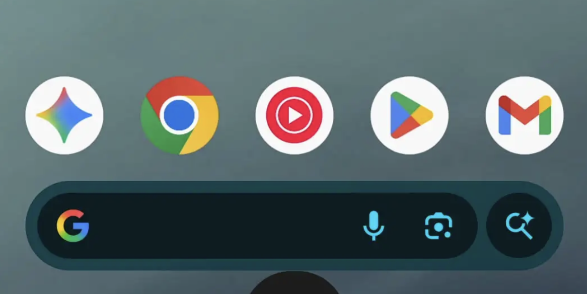
For those not seeing the change right away, Google suggests force-stopping the app from the “App info” page to trigger the update. With Gemini increasingly central to Android’s AI experience, this subtle redesign underscores Google’s ongoing effort to make its assistant tools feel more fluid, modern, and consistent with the rest of the Pixel interface.

What do you think?
Happy0
Sad0
Love0
Surprise0
Cry0
Angry0
Dead0
This Tecno concept could kill smartphone bezels for good
OpenAI’s AI agents apparently started a jailbreak group chat
Emirates just gave premium economy a business-class feature
A new Disney+ app is coming to MENA, and it’s more than just a redesign
Luna Band skips subscriptions and makes personalisation its focus
Best Sony back-to-school: four upgrades for studying, gaming and campus life
Follow US
Caffeine. Chaos. Content.
© Absolute Geeks Media FZE LLC 2014–2026.
Proudly made in Dubai, UAE ❤️
Contact · About · Editorial Policy · Privacy Policy
Welcome Back!

Sign in to your account

Username or Email Address
Password

Lost your password?