By using this site, you agree to our Privacy Policy and Terms of Service.
Accept
Absolute Geeks UAEAbsolute Geeks UAE
  • STORIES
    • TECH
    • AUTOMOTIVE
    • GUIDES
    • OPINIONS
  • REVIEWS
    • READERS’ CHOICE
    • ALL REVIEWS
    • ━
    • SMARTPHONES
    • CARS
    • HEADPHONES
    • ACCESSORIES
    • LAPTOPS
    • TABLETS
    • WEARABLES
    • SPEAKERS
    • APPS
  • WATCHLIST
    • TV & MOVIES REVIEWS
    • SPOTLIGHT
  • GAMING
    • GAMING NEWS
    • GAME REVIEWS
  • +
    • OUR STORY
    • GET IN TOUCH
Reading: Google quietly updates its ‘G’ logo for the first time in nearly a decade
Share
Notification Show More
Absolute Geeks UAEAbsolute Geeks UAE
  • STORIES
    • TECH
    • AUTOMOTIVE
    • GUIDES
    • OPINIONS
  • REVIEWS
    • READERS’ CHOICE
    • ALL REVIEWS
    • ━
    • SMARTPHONES
    • CARS
    • HEADPHONES
    • ACCESSORIES
    • LAPTOPS
    • TABLETS
    • WEARABLES
    • SPEAKERS
    • APPS
  • WATCHLIST
    • TV & MOVIES REVIEWS
    • SPOTLIGHT
  • GAMING
    • GAMING NEWS
    • GAME REVIEWS
  • +
    • OUR STORY
    • GET IN TOUCH
Follow US

Google quietly updates its ‘G’ logo for the first time in nearly a decade

GEEK DESK
GEEK DESK
May 13

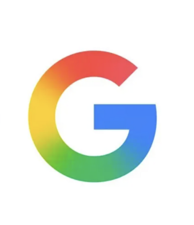
Google has made a subtle but notable change to its iconic “G” logo, marking the first update to the emblem in nearly a decade. The new version, now visible in the Google app on iOS, replaces the familiar block-color design with a smoother, blended gradient that transitions seamlessly through red, yellow, green, and blue hues.

The update comes quietly, with no official announcement from Google at the time of writing. The change has not yet rolled out universally—Android users and visitors to Google’s web properties will still see the older version of the logo, which features distinct color segments. The update was first spotted by users and reported by 9to5Google.

While the change may appear minor at first glance, the move reflects a broader visual shift in Google’s branding. The new gradient closely mirrors the aesthetic found in the company’s Gemini branding, which features similar color blending. It suggests a more unified and polished design language across Google’s expanding ecosystem of apps and services.

The last major redesign of Google’s logo happened in 2015, when the company transitioned to a sans-serif typeface and introduced the multi-color “G” icon that has become a fixture in mobile apps and browser tabs. That update was part of a larger push to modernize Google’s visual identity across devices and screen sizes.

This latest revision doesn’t overhaul the core design but instead softens it, likely in an effort to align more closely with contemporary app icon trends that favor gradients and fluid transitions over hard-edged color blocking. It may also reflect how Google’s identity is evolving in the age of AI, where branding is expected to signal both technical sophistication and visual harmony.

There’s no word yet on when—or if—the new logo will be extended to Android, Chrome, or other Google platforms. For now, it remains exclusive to the iOS version of the app, giving Apple users the first glimpse at the next phase of Google’s visual branding.

Share
What do you think?
Happy0
Sad0
Love0
Surprise0
Cry0
Angry0
Dead0

WHAT'S HOT ❰

Spotify adds Peloton workouts and creator fitness content to premium tier
Seagate updates consumer storage lineup amid rising data demands
Lynk & Co 10 brings 900 horsepower EV performance to the mainstream price segment
LG UltraGear OLED evo 52 inch monitor brings 5k2k and 240hz to large format gaming displays
Sennheiser HD 480 PRO brings tighter bass and better comfort to closed-back monitoring.
Absolute Geeks UAEAbsolute Geeks UAE
Follow US
AbsoluteGeeks.com was assembled during a caffeine incident.
© Absolute Geeks Media FZE LLC 2014–2026.
Proudly made in Dubai, UAE ❤️
Upgrade Your Brain Firmware
Receive updates, patches, and jokes you’ll pretend you understood.
No spam, just RAM for your brain.
Welcome Back!

Sign in to your account

Username or Email Address
Password

Lost your password?