
Instagram has unveiled its first wordmark redesign in a decade, and the internet has responded in the traditional way it handles even the smallest change to a familiar social platform: by making fun of it.
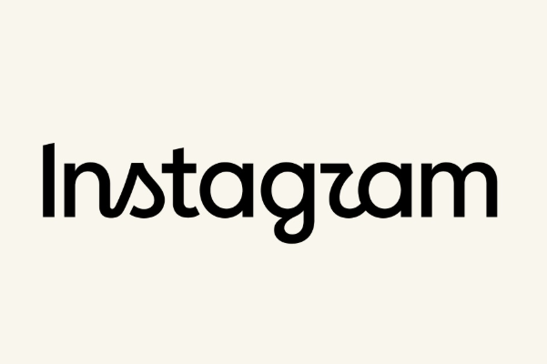
The Meta-owned platform introduced a refreshed Instagram wordmark that keeps the handwritten style of the previous version while altering several of its letters. Instagram head Adam Mosseri described the redesign as cleaner and more modern, with visual references to the platform’s original identity. The familiar multicoloured camera app icon, however, is staying exactly where it is.
Unfortunately for Instagram’s designers, users quickly discovered another interpretation of the new lettering.
Much of the attention has fallen on the stylised “r”, which some people think looks more like a “z”, “u” or “w”. The “s” has also caused confusion, with users joking that the new wordmark appears to spell names including “Instagzam”, “Instagwam” and even “Instaguam”.
One commenter responding to Mosseri’s announcement wondered whether the logo now read “instagzam”, while another joked that “Instagwam” sounded like a toddler trying to pronounce Instagram. Someone else turned the unusual lettering into a geography joke, suggesting “Instaguam” was finally giving the US territory some recognition.
The criticism was not limited to jokes. Some users questioned whether the new typography was actually more readable than the design it replaces, while others defended it as conventional cursive lettering being misinterpreted by people less accustomed to handwritten scripts.
Social media consultant Matt Navarra landed somewhere in the middle, praising the new look while acknowledging that designers were inevitably going to spend the day pulling it apart. Mosseri himself appeared prepared for that response, sharing the announcement on Threads while inviting the inevitable “hot takes.”
Instagram has been through this cycle before. Its major 2016 redesign replaced the detailed retro-camera icon with the much simpler gradient camera symbol still used today. That change generated plenty of criticism at the time, only to become virtually invisible through years of familiarity.
There is also a more serious layer beneath the logo jokes. Some commenters used Mosseri’s announcement to complain about problems they consider considerably more important, including bots, AI-generated content and difficulties recovering creator and business accounts. One account with 12.9 million followers called for clearer answers and better support for legitimate users losing access to their pages.
None of that has much to do with the team responsible for redesigning a wordmark, but it demonstrates what happens when a platform used by billions announces a cosmetic refresh. Every curve becomes a debate, every letter becomes a meme, and somebody will inevitably ask why the company isn’t fixing something else.
Instagram wanted a cleaner logo. The internet saw “Instagzam.” At least everyone can agree people noticed it.