


Google is continuing its gradual redesign of app icons, extending the new gradient style it began introducing earlier this year to more of its popular apps. The latest updates affect Google Maps and Google Photos, both of which now adopt the softer, blended color scheme that Google says reflects its broader shift toward AI-driven design.
The company first rolled out the new aesthetic in May 2025 with an updated Google app icon, replacing the rigid, segmented red, yellow, green, and blue “G” with a continuous gradient where each color merges smoothly into the next. Soon after, the Gemini icon was also reworked—its former blue-and-purple palette replaced by a similar multi-color gradient. In September, Google explained that these design updates were meant to represent a unified visual identity for the brand, symbolizing what it described as a wave of creativity and innovation tied to its artificial intelligence initiatives.
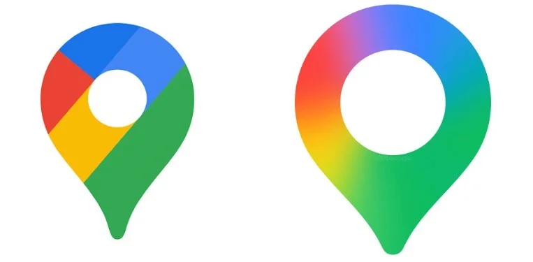
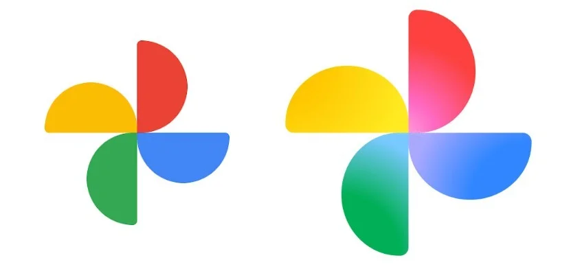
That same design philosophy now extends to the icons for Google Maps and Google Photos. The new Maps icon retains its signature pin shape but replaces the bold, blocky color segments with a thinner outline, a larger circular cutout, and a four-color gradient. The refreshed design is meant to feel lighter and more consistent with Google’s evolving design language. In contrast, the new Photos icon maintains its familiar four-blade pinwheel, but each blade now transitions from a lighter interior to a deeper exterior shade, giving the symbol a more fluid and dimensional appearance.
Although Google has not confirmed exact rollout dates, many devices, including some Pixel models, still display the older icons for Photos and Maps. The company says additional updates will reach users “across more products, platforms, and services” in the coming months. Apps such as Google Play, Chrome, and Calendar—each still using the older segmented four-color style—are expected to receive similar treatment in due time.
The redesign is part of Google’s ongoing effort to establish a unified visual identity across its ecosystem while subtly highlighting its focus on AI as a core theme of its products. The shift from flat, separated colors to blended gradients marks a small but noticeable evolution in the company’s design philosophy—one aimed at making its icons feel more dynamic, contemporary, and interconnected.