

Microsoft appears to be testing a new design for its Office suite icons, marking the first visual update since 2018. Although the company has yet to formally unveil the revised icons or share a release timeline, images of the updated set have already begun circulating online, thanks to community efforts.
Last month, Microsoft reportedly solicited user feedback on a series of new Office icons, hinting that a design refresh may be in the works. While official assets remain unavailable to the public, a Reddit user known as u/Thunder_Ruler0 took initiative and recreated a high-resolution icon pack based on the images Microsoft shared during its internal feedback phase. These are not official files—nor are they pixel-perfect—but they offer a compelling preview of what a future Office update might include.
According to the creator, the icons were developed by refining leaked visuals, followed by a process of downscaling, upscaling, and AI-assisted enhancement using DALL·E 3. The entire project reportedly took about two hours, and the user has stated they don’t plan to refine them further. Despite their unofficial status, the icons have drawn attention from users eager for a visual refresh, especially given how slowly interface updates tend to roll out across Microsoft products.
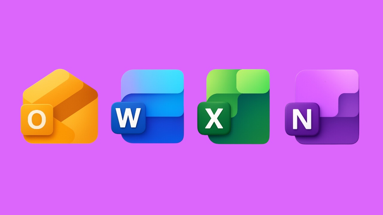
Among the most discussed changes is the Outlook icon, which appears in yellow rather than the current blue. This color choice is a nod to the application’s earlier design and has been well received by some users, who feel the warmer tone better represents the brand’s legacy.
It’s unclear if or when Microsoft will implement the redesigned icons across its Office apps. Past design experiments have sometimes stayed internal or been heavily altered before public release. For now, this unofficial pack offers a way for users to experiment with a refreshed look, though it does require converting PNG files to ICO format in order to apply them as app icons.
As Microsoft continues to evolve its visual identity, community-made alternatives like this one highlight the appetite for more modern and personalized interface options. Whether the official release matches these previews or takes a different direction remains to be seen, but early interest suggests users are ready for a change.