
Every year, a new watchOS arrives promising to make your wrist smarter, and every year most people install it, glance at a new watch face, and carry on exactly as before. watchOS 27, which landed on September 14, is not that kind of update. It changes how you get around the watch itself, removes a feature some people genuinely relied on, and hands Siri a far bigger role than it has ever had on the Apple Watch. Some of the best additions work on older supported models, not just the shiny Series 12 and Ultra 4. A few of the most talked-about tricks are locked to that new hardware, and one of them hasn’t even shipped yet.
This guide sorts out what matters, what is mostly marketing garnish, and which changes will confuse you in the first ten minutes. Installing it is simple enough: open the Watch app on your iPhone, head to General and then Software Update, put the watch on its charger, and let it do its thing. The harder part is knowing what you have just agreed to, because a couple of these changes rewire gestures you have probably performed thousands of times. Think of it less like a patch and more like a new season of a game where the developers moved the inventory button. You will adapt, but it helps to read the patch notes first.
The Digital Crown no longer does what you think it does
The single change most likely to make you swear at your wrist involves the double press of the Digital Crown. In watchOS 26 and earlier, that gesture opened the App Switcher, the place where you hopped back to a previous app, scrolled through recent ones and swiped away anything that had frozen. In watchOS 27, a double press now brings up the new dynamic app grid instead. Apple has reserved that gesture for Live Rewind, a feature that isn’t available yet and will only run on the newest watches. For owners of older models, that means a familiar shortcut has been reassigned to a feature they will never get, which is a slightly awkward trade.
The good news is that the App Switcher isn’t dead, only exiled for a while. It returns with watchOS 27.2 later this year, triggered by a long press at the bottom of whichever app you are using, and people already running the beta can try that gesture now. Until then, force-quitting a misbehaving app is less convenient than it used to be, which matters more than it sounds if you rely on third-party apps that occasionally hang. My advice is to learn the new grid rather than fight it, and to treat the switcher’s return as a quality-of-life fix you are waiting on rather than a lost cause.
The new app grid is smarter, and the honeycomb finally steps aside
A single press of the Crown also behaves differently now. The honeycomb layout that has defined the Apple Watch since day one is no longer the default, replaced by a dynamic grid built from suggested apps, the ones you use most and the ones you opened recently. The Siri app sits right in the middle, which tells you everything about where Apple’s priorities lie this year. If you are someone who knows exactly where every app lives, you can still turn the Crown to scroll through the full alphabetical list. That fallback is important, because prediction-based layouts are only as good as their guesses.
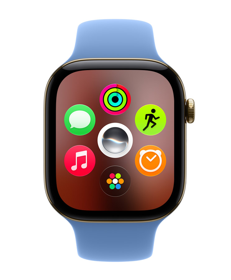
In practice, this is the kind of change that should help most people and irritate a vocal few. The honeycomb looked iconic on a keynote slide, but finding a tiny bubble with a fingertip was always more of a skill check than a design triumph. A grid that surfaces what you probably want right now is more sensible on a screen this small. The trade-off is predictability, since apps may not always sit in the same spot. Power users who navigate by position rather than by looking will need a week or so to stop tapping the wrong thing.
Tap joins Double Tap and Wrist Flick in the gesture lineup
Apple has added a third hands-free gesture, and it’s refreshingly literal: it’s called Tap. A single tap of your index finger and thumb opens whichever widget is highlighted in the Smart Stack. Double Tap still moves you through the stack, and Wrist Flick still dismisses notifications, so the new gesture slots in as the missing “select” button. Anyone who has played a game with only “next” and “back” controls will understand why this matters. Being able to scroll without being able to open things was always a slightly incomplete control scheme.
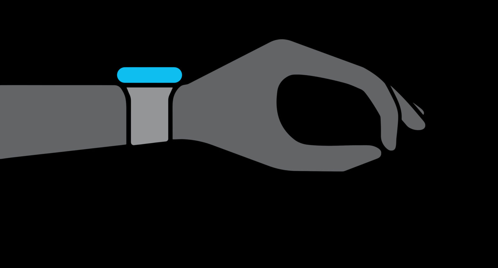
This is one of those changes that sounds tiny but could quietly become the way you use the watch most, especially when your other hand is holding coffee, a shopping bag, or a gym dumbbell. The obvious caveat is that three similar finger gestures create more room for accidental inputs, and whether single and double taps feel distinct enough will vary from person to person. It’s worth spending a few minutes practising the difference before relying on it mid-workout. Gesture control lives or dies on reliability, and it’s something you should judge for yourself rather than trust the keynote demo.
Siri gets its own app and suddenly matters on your wrist
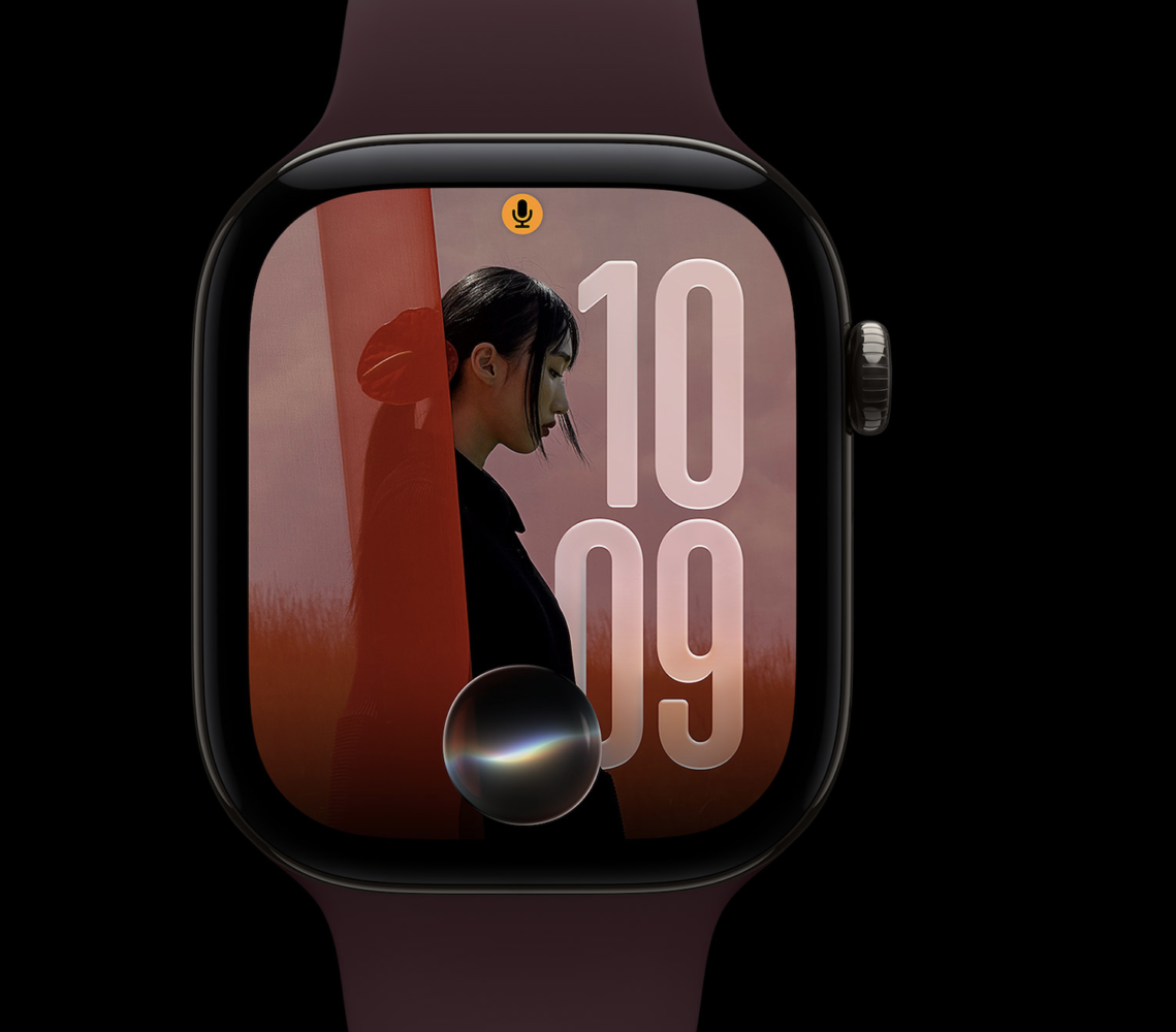
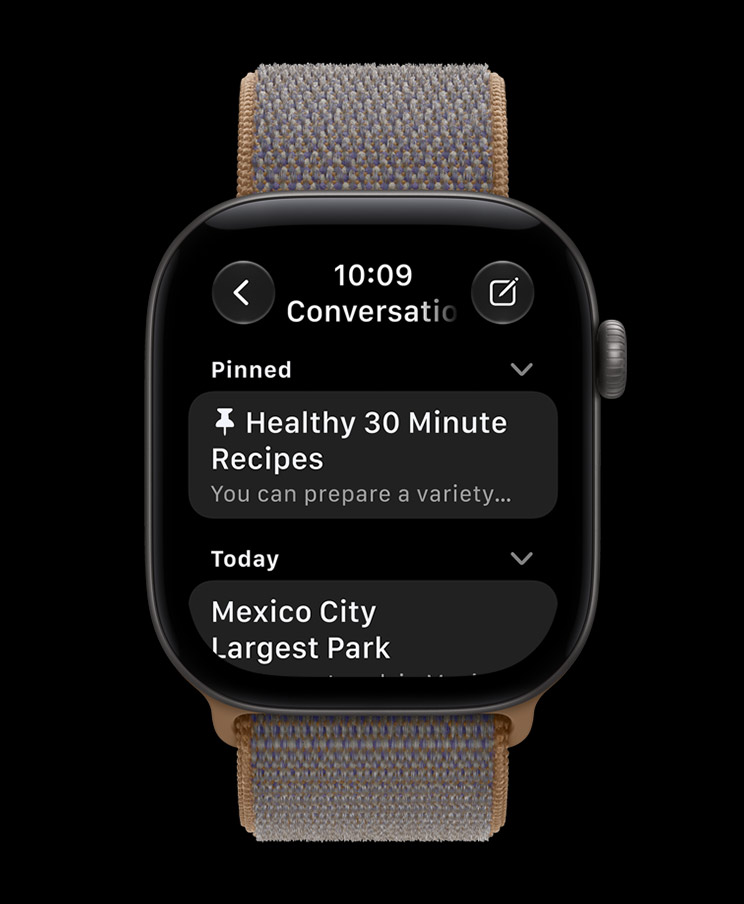
For years, Siri on the Apple Watch felt like the side character who shows up, says one line and vanishes. watchOS 27 changes that with a dedicated Siri app that gathers all your conversations in one place and syncs them privately through iCloud across your devices. Start a query on your iPhone and you can continue that same thread on your wrist, pin conversations you want to keep, or open a fresh chat directly from the watch. Siri now also has contextual awareness, which is the whole point of catching up with the AI assistant wave rather than merely setting timers faster. The continuity is the genuinely clever bit, because the watch is a terrible place to type a detailed request but a brilliant place to check an answer.
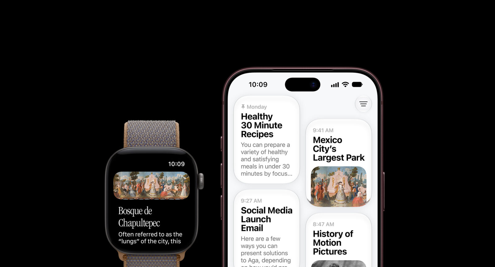
Should you be excited or sceptical? A bit of both, honestly. Conversation history and cross-device syncing are sensible features that other AI assistants have trained people to expect, so their arrival feels overdue rather than revolutionary. The real test is whether Siri’s answers are good enough to justify having a whole app front and centre in the new grid, and that’s something no feature list can promise. If you already lean on Siri, this is the biggest upgrade in the release; if you’ve long since given up on it, the new app is a reasonable excuse to give it another shot rather than a reason to rush.
The Siri watch face and a Smart Stack with more to say
Alongside the app comes a new Siri watch face, and it’s more useful than the name suggests. Its large rectangular complication displays whatever currently sits at the top of your Smart Stack, and it refreshes throughout the day based on time, location and other signals. That turns the face into a living dashboard rather than a static arrangement of rings and weather icons. If you have ever spent twenty minutes perfecting complications only to ignore half of them, a face that picks the relevant one for you is a tempting alternative. People who love a fixed, carefully curated layout will probably stick with what they have.
The Smart Stack itself has also become far better at reading the room. Apple’s examples include surfacing where you parked, reminding you about a close contact’s birthday, flagging a change in your transit card balance, opening the Noise app right after a loud-noise alert, and nudging you when Theater Mode is still switched on. Pinned messages, celebrations and identity cards can also appear. None of these is earth-shattering alone, but together they push the watch closer to the proactive assistant it was always meant to be. The Theater Mode reminder alone might save a few people from spending a day wondering why their watch has gone suspiciously quiet.
Fitness upgrades that don’t need new hardware
Workout Buddy, introduced in watchOS 26, used to need your iPhone nearby, which undercut the entire fantasy of leaving your phone at home for a run. In watchOS 27, the watch can run it on its own as long as it has Wi-Fi or cellular. It now also draws on your training history to point out gradual improvements in pace, distance and workout length, and it speaks Spanish as well as English. That combination makes it far more useful for people who train with a cellular watch and nothing else. If your model lacks cellular, though, you will still be tethered to Wi-Fi or your phone, so the freedom depends on what you bought.
Indoor exercisers get a meaningful fix too. New machine-learning motion algorithms measure distance more precisely for indoor runs and walks, and Apple says the improvement applies from the very first step instead of settling in after a few minutes. Route maps in Fitness are more accurate, and step counts now stay in sync between the Fitness and Health apps, which should end one of the more baffling inconsistencies of the platform. Treadmill tracking has long been the weak spot of wrist-based wearables, so any gain here matters to people who log serious mileage indoors. As always, if your numbers matter for training plans, compare them against the treadmill’s own readout for a few sessions before trusting either completely.
Cycle Tracking adds perimenopause awareness
The Health app’s Cycle Tracking can now notify users when their logged patterns suggest perimenopause, alongside new symptom tracking and educational material. These notifications rely only on the cycle history you have logged yourself, and they apply to users aged 40 and over. Apple is careful to state that the feature is not a diagnosis and is not a form of birth control, and those disclaimers deserve to be taken seriously. What it offers is an early prompt to pay attention and perhaps start a conversation with a doctor, which is a genuinely useful role for a device you wear all day. It’s a quiet addition compared with a flashy watch face, but it could matter more to the people it applies to than anything else in this release.
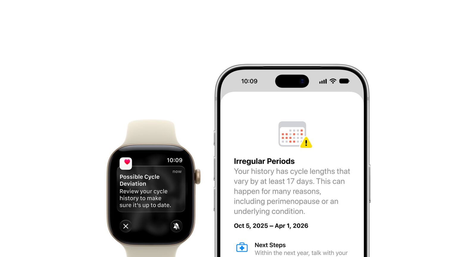
The obvious limitation is that the feature is only as good as the data behind it. If you log inconsistently, the watch has less to work with, so anyone interested should get into the habit of recording cycles and symptoms regularly. It’s also worth remembering that perimenopause shows up in many ways that a cycle log won’t capture, which is precisely why Apple frames this as awareness rather than an answer. Used that way, it’s a thoughtful, well-scoped health feature rather than an overpromise.
Find My gets tidier as Walkie-Talkie disappears
Find Devices, Find Items and Find People have been merged into a single Find My app built around a map, with shortcuts for directions and for nearby items. This is simply better design, since hunting for the right one of three separate apps to locate your keys was never an efficient experience. A map-first layout also makes sense on a small screen, where a single glance tells you more than a list ever could. It won’t change your life, but it removes a small, recurring annoyance, which is exactly what a good software update should do.
Now the bad news: Walkie-Talkie is gone, and not in the “hidden in settings” sense. Once you update to watchOS 27, the app is unavailable and cannot be reinstalled from the App Store. You can technically keep it by staying on watchOS 26, but you won’t be able to start a conversation with anyone who has updated, which makes holding out a lonely strategy. If your family or friends used Walkie-Talkie heavily, agree on a replacement, such as voice messages, before everyone updates, rather than discovering the gap mid-conversation.
What Series 12 and Ultra 4 owners get exclusively
Some features are reserved for Apple Watch Series 12 and Ultra 4, and it’s worth being clear about which ones. The redesigned pedometer model paired with the S11 chip allows watchOS 27 to deliver more accurate step counts on these models, and they also get a new Steps complication that shows your count in real time on the watch face. Whether older models will ever get that complication is an open question, so don’t upgrade your hardware expecting it to trickle down or not. If step counting is your main fitness metric, this is a modest but real reason to favour new hardware.
Live Rewind is the headline exclusive, and also the one you can’t use yet. It’s designed to produce a transcript of the last fifteen seconds of speech around you, which is a fascinating idea for catching a name you missed or a detail you didn’t quite hear. But a feature that hasn’t launched is a promise, not a selling point, and I’d never recommend buying a watch for a capability you can’t evaluate. It also raises obvious questions about how it will work in practice and how people around you might feel about it, which deserve answers when it actually arrives. For now, file it under “interesting sci-fi gadget, pending review.”
Bottom Line
watchOS 27 is one of the more consequential Apple Watch updates in years, mostly because it changes how you move around the device rather than just adding widgets. The new app grid, the Tap gesture, the smarter Smart Stack, the unified Find My app and the standalone Workout Buddy are all solid improvements that reach older supported watches, so most owners gain something real by updating. The costs are the temporary loss of the App Switcher’s familiar gesture and the permanent removal of Walkie-Talkie, and anyone who depends on either should plan around that before tapping install.
If you own a recent supported watch, update, give yourself a week to relearn the Crown, and explore the Siri app and watch face. If you rely on Walkie-Talkie with people who aren’t updating, you may want to wait, though holding out won’t help for long once others move on. And if you’re tempted to buy a Series 12 or Ultra 4 purely for this release, the improved step accuracy is a real perk, but Live Rewind shouldn’t factor into your decision until it actually ships.