
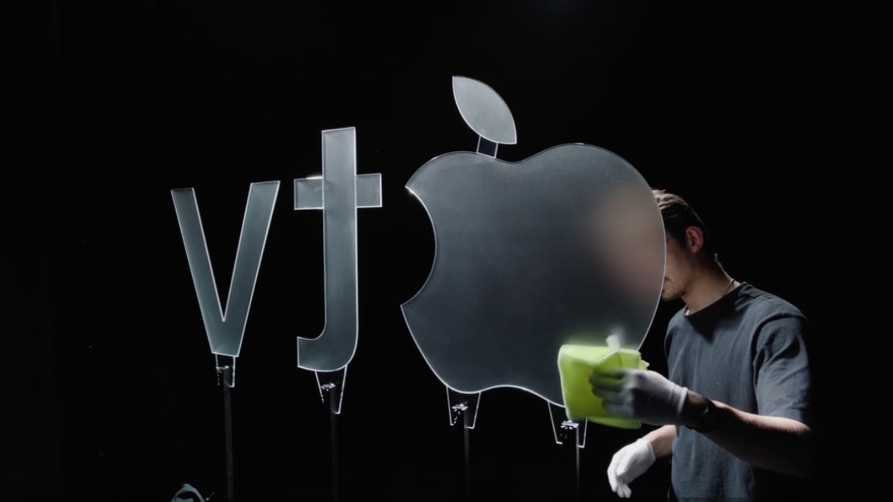
Apple’s latest rebrand of Apple TV includes a new five-second logo sequence that looks digital but was created entirely with real glass. Instead of relying on computer animation, the production team built large glass versions of the Apple logo and the “tv” lettering, filming them in a studio with live lighting and camera movement. The resulting effect — shifting reflections and subtle motion — comes not from digital rendering but from the camera and lights moving around the static glass pieces.
The decision to use physical materials rather than visual effects marks a deliberate stylistic choice for Apple, which has faced mixed reactions to its recent rebranding. The company dropped the “+” from Apple TV+, a move that blurred distinctions between its streaming service, set-top box, and app. However, this handcrafted logo sting seems designed to emphasize a return to tactile artistry and tangible design at a time when much of Apple’s visual identity has leaned heavily on digital polish.
According to AdAge, the concept came from Tor Myhren, Apple’s vice president of marketing communications. Myhren, who has spoken publicly about balancing technology with human creativity, reportedly wanted the new visual identity to reflect Apple’s continued reliance on real-world craftsmanship even as the company expands its use of AI-driven production tools.
The short film was produced by Optical Arts, Finneas, and TBWA\Media Arts Lab, Apple’s long-standing advertising partner. A behind-the-scenes timelapse released by AdAge shows crew members physically adjusting lights and camera rigs to achieve the final look — an approach that contrasts sharply with the company’s more recent “Liquid Glass” visual design language from iOS 26.
The result is both nostalgic and strategic: a minimalist, practical effect that underscores Apple’s broader message about valuing human artistry within modern production. Whether audiences notice the craftsmanship behind a five-second logo remains to be seen, but the choice clearly signals a quieter, more grounded direction for Apple’s brand visuals.