TL;DR: The Epomaker Glyph is a delightfully quirky, ultra-solid 75 percent mechanical keyboard that masterfully pairs vintage typewriter aesthetics with modern versatility. While the high-profile chassis demands a steep ergonomic adjustment and the dual screens suffer from limited customization options, the rock-solid build quality and blissful typing acoustics make it an enjoyable experience while also being a spectacular conversation piece for any tech enthusiast.
Epomaker Glyph Keyboard
I have officially tumbled headfirst down the mechanical keyboard rabbit hole, and my guide through this clicking, clacking wonderland is the wildly unique Epomaker Glyph. If you have ever scrolled through specialized desk setup forums late at night, you know how deep the mechanical obsession runs. For my very first foray into this boutique hardware universe, I have been pushed straight into something wonderfully outlandish.
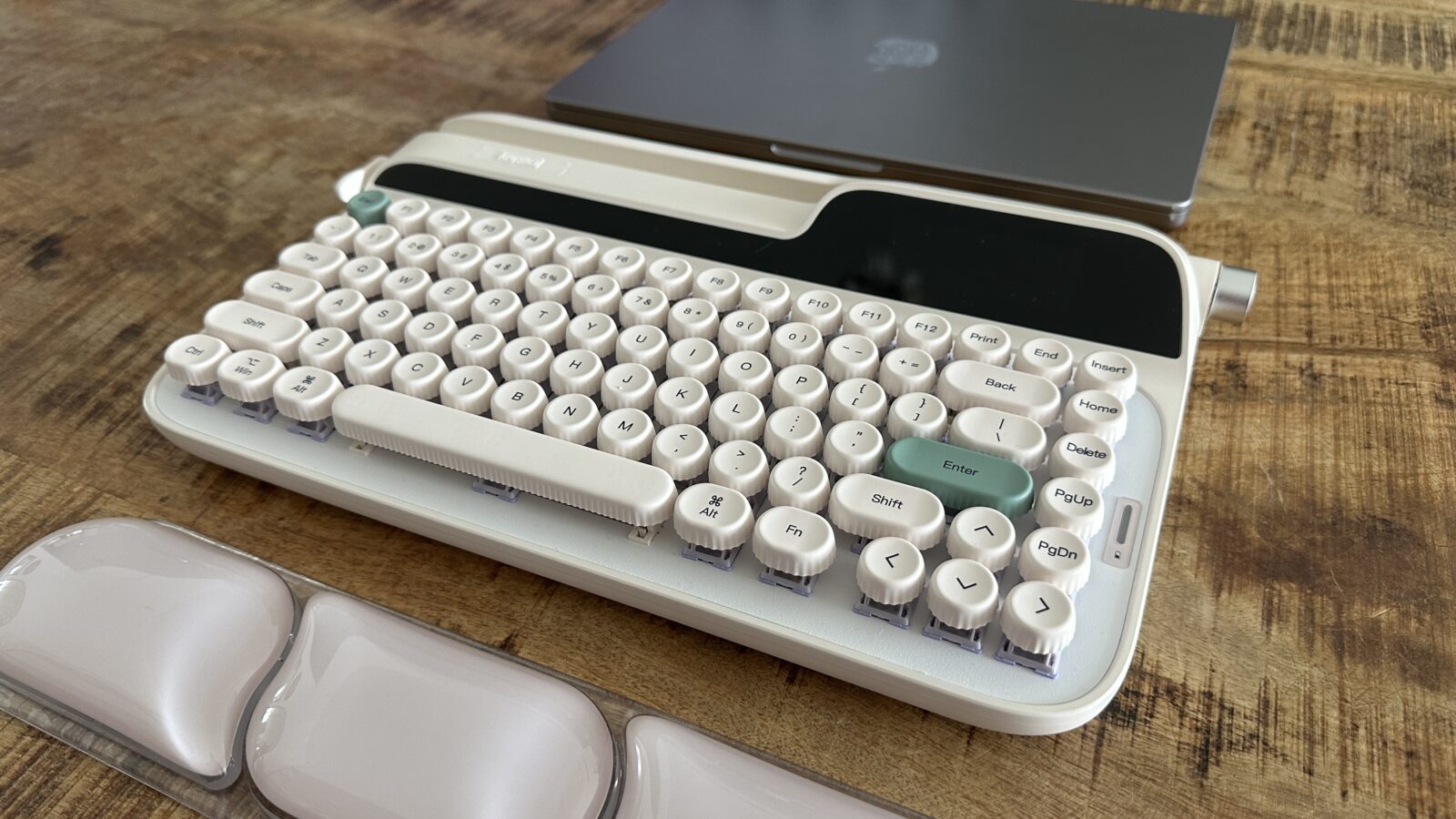
The aesthetic of the Epomaker Glyph immediately evokes a retro-futuristic typewriter that might belong on the desk of a high-ranking sci-fi bureaucrat. It sports a creamy beige color scheme with lovely pastel accents that skew slightly toward a softer, more elegant design palette. While it looks like a prop salvaged from an alternative timeline where the typewriter never died, it packs all the wireless conveniences a modern tech enthusiast could ever ask for. This is not just a peripheral that sits quietly on your desk, but rather a bold fashion statement that immediately redefines your entire workspace.
Right out of the box, the physical presence of this device is absolutely immense. It is a chunky 75 percent layout machine that looks like it could survive a small meteor impact without skipping a single beat. The chassis feels incredibly dense and solid, telegraphing an instant sense of premium build quality that you rarely find in standard plastic peripherals. From the integrated tablet cradle along the top ridge to the mechanical elements flanking the sides, everything about this keyboard screams hardware maximalism.
The Click the Clack and the Learning Curve Keycaps
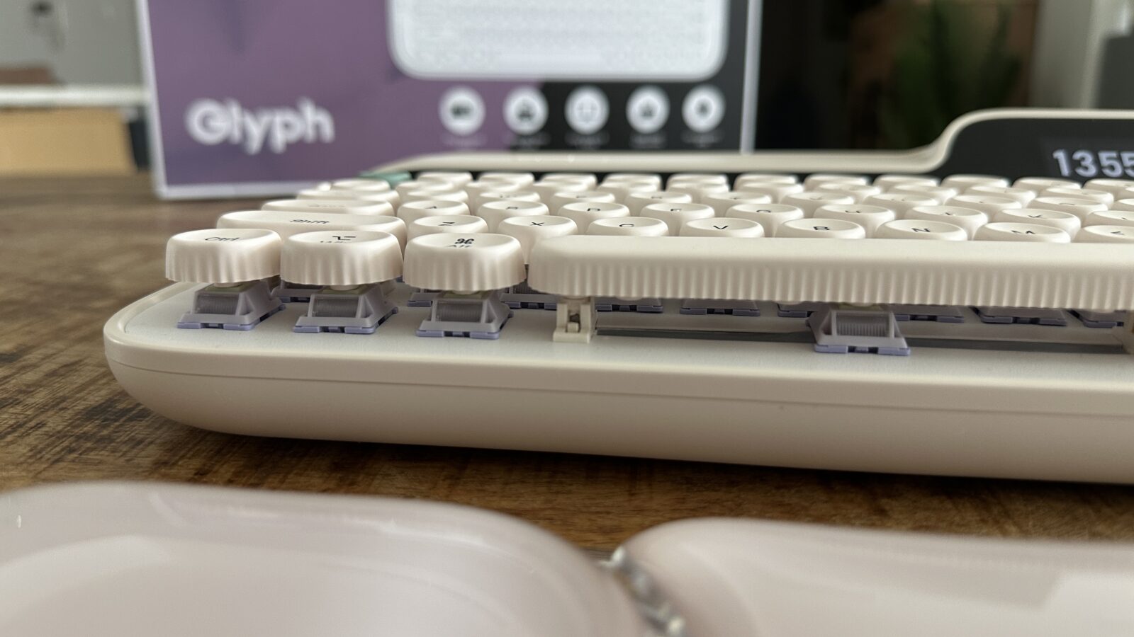
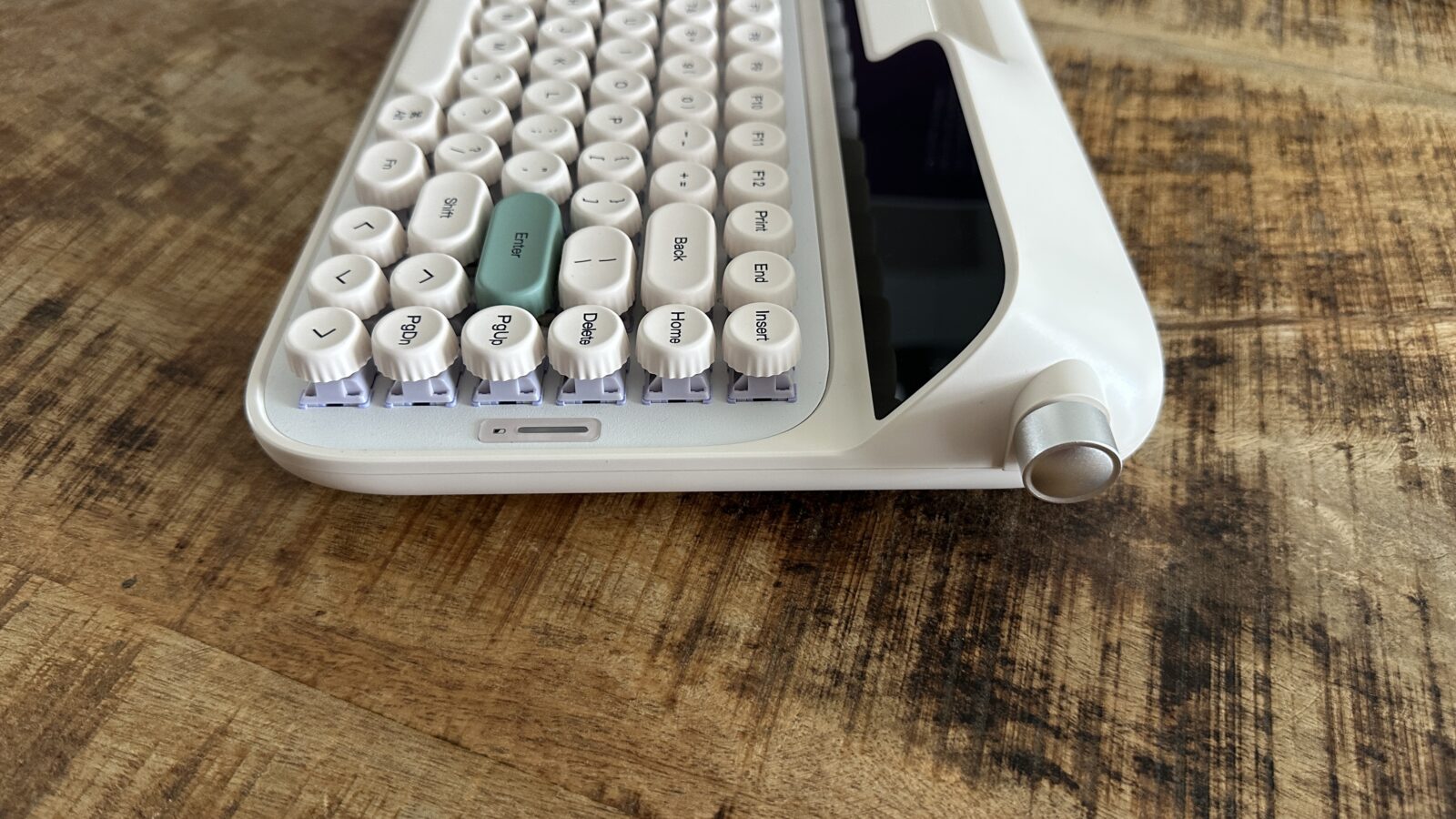
When it comes down to actual daily use, the single most critical aspect of any keyboard is the tactile typing experience. Transitioning from flat, modern laptop switches to a fully realized mechanical ecosystem presents a bit of a learning curve. The keys on the Glyph are uniquely rounded and uniform in height, mimicking the classic circular glass caps of an antique manual typewriter. Because my muscle memory was deeply trained on square, contoured keycaps, my fingers spent the first few days slipping and sliding around this circular landscape.
Once you push past that initial adjustment period, typing on this machine becomes an absolute joy. Epomaker equipped this deck with pre-lubed linear switches that register keypresses with a silky, fluid motion. Every single keystroke feels incredibly deep and satisfying, bottoming out against the frame with a rhythmic cadence that makes regular emails feel like important literature. The sound profile is beautifully dampened, producing a deep, creamy thunk (ok it’s hard to express in word) rather than a sharp, metallic pinging sound.
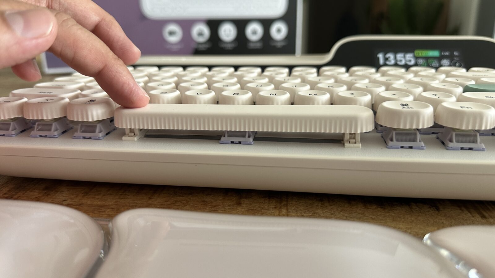
What truly blew my mind regarding the overall structural integrity was the complete absence of body flex. Cheap, and sometimes expensive, keyboards often creak or bend when you apply heavy pressure, but this chassis remains as rigid as a block of granite. The ultimate benchmark of a premium keyboard layout is always the spacebar stabilization, and Epomaker completely nailed this engineering detail. No matter which edge you strike, the entire spacebar depresses as one singular, perfectly balanced unit without any annoying rattle, bliss!
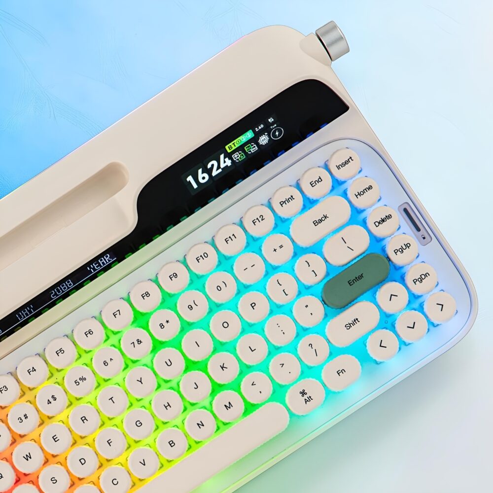
Levers, Knobs and Dual Screens of Pure Nostalgia
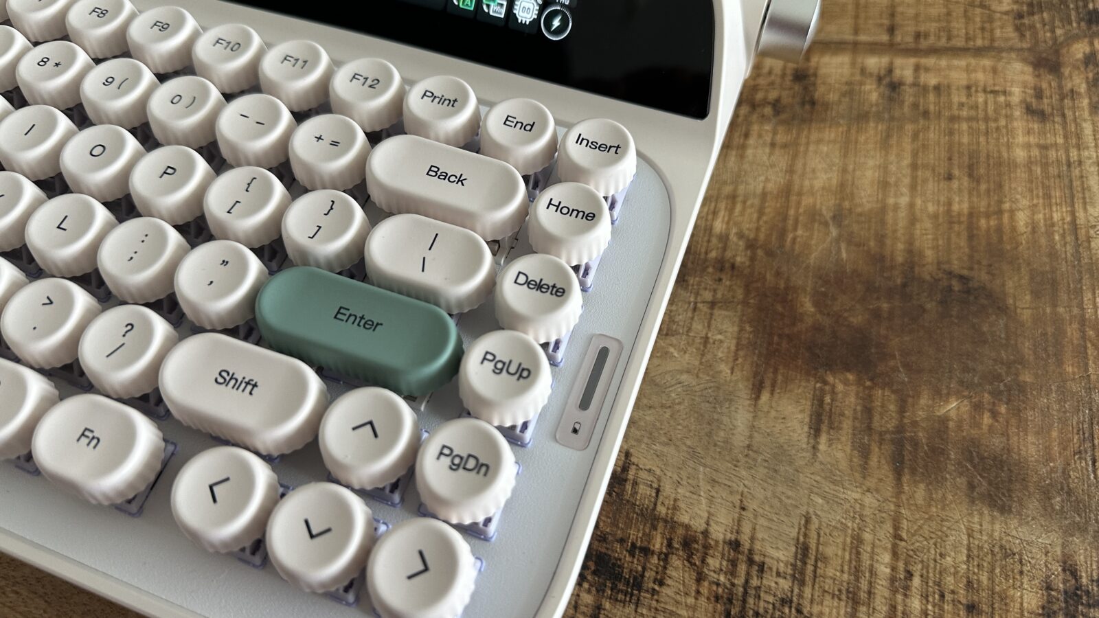
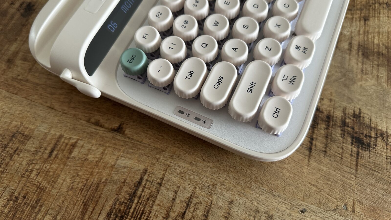
Beyond the satisfying typing acoustics, the Glyph is packed to the absolute brim with quirky, hardware-level features. The most prominent novelty is the metal return lever situated on the left side of the chassis, functioning as an intentional throwback to vintage writing machines. Pushing this lever upward registers a standard carriage return or new line, while pulling it downward triggers the delete key. You cannot remap or customize this analog lever in the configuration software, but it feels so deeply satisfying that I am perfectly content leaving it exactly as the designers intended.
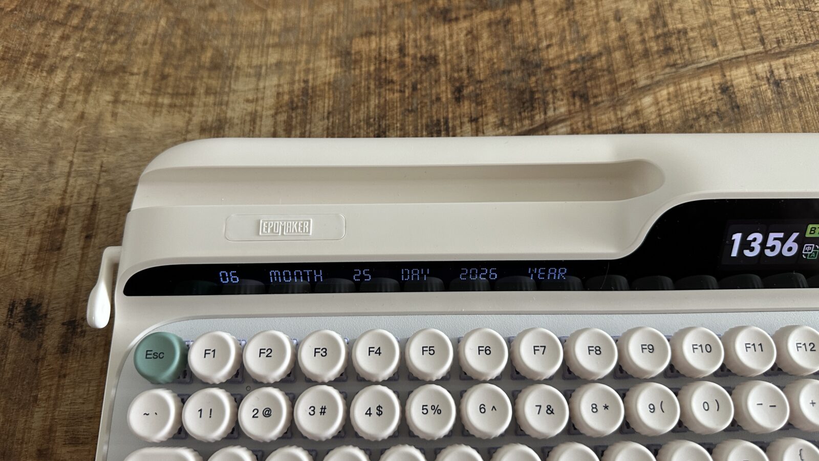
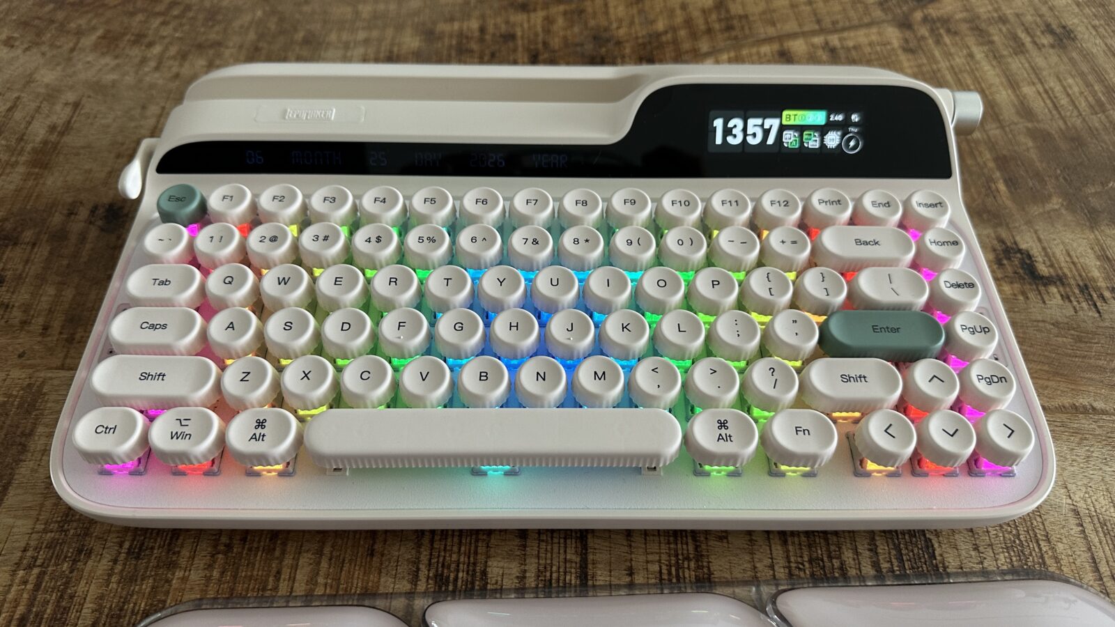
Then we have the dual display screens flanking the upper deck, which represent a fascinating mix of brilliance and missed opportunity. The left screen sits right below the integrated tablet slot and is entirely hardcoded to display the current date in a stylized, wordy format. Initially, I found it deeply irritating that I could not transform this display into a custom stock ticker or a live subscriber counter for my social channels. Over time, however, I grew to appreciate this absolute lack of fuss, treating it as a reliable, zero-maintenance desktop calendar. The biggest issue is screen viewing angles are abysmal, meaning the readability changes drastically depending on how low you sit at your workstation, with some lighting and angles making this screen particularly unreadable.
The right-hand screen serves as your primary hardware status dashboard, showing your current wireless connection, active operating system mode, and the time. This display allows for a tiny bit of user customization, letting you upload animated GIFs and images using the official desktop software. While this is pretty cool, adding GIF’s to this keyboard takes away from the retro look, and limiting the customisation to just this is a major missed opportunity.
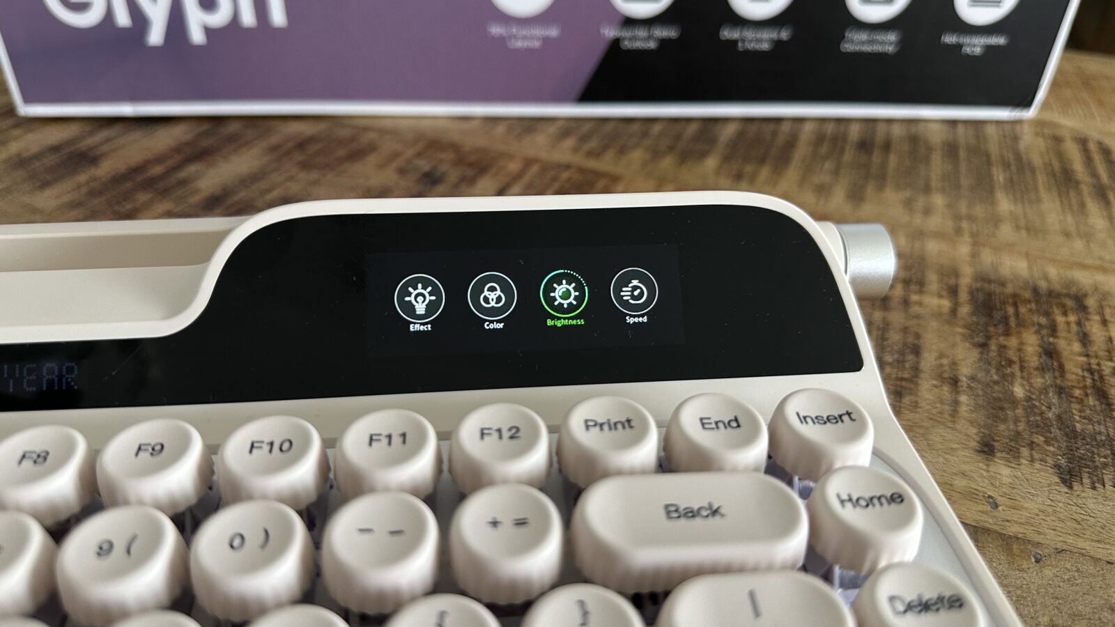
For both screens the display brightness is completely locked, with no apparent hardware shortcut or software toggle available to dim the screen.
Lastly, you get a knob on the side of the keyboard, which adds some good usability without taking away from the design. You can rotate up, down and even press to do different things. By default this controls the volume and acts as a play/pause button, but all this can be customised using the software.
Software to forget
In order to maximise the keyboard you most probably need to dive into the software. For the glyph that is the epomaker driver V4. Unfortunately this software leaves a lot to be desired as it feels unpolished. The Mac app is also not built for Apple Silicon which might mean it won’t be supported on future macOS versions. Running this keyboard completely driverless is often the superior experience.
While the app does offer a lot of features like custom zones, different lighting effects, controlling all the settings of the keyboard and even customising the keys. The whole experience is clunky and at times the app just straight up doesn’t work unfortunately.
The software really was the weakest point of this keyboard. The only potential saving grace was the Community Share section which allows for you to be able to see what the community has built, however for me, this feature wasn’t consistent and only worked part of the time and when it did, it was extremely slow. I truly hope that EPOMAKER will update this app. However there is something amazing in the keyboard which might make it so that you won’t need the app at all. More on that below.
Lighting Up the Glyph Without Bloatware
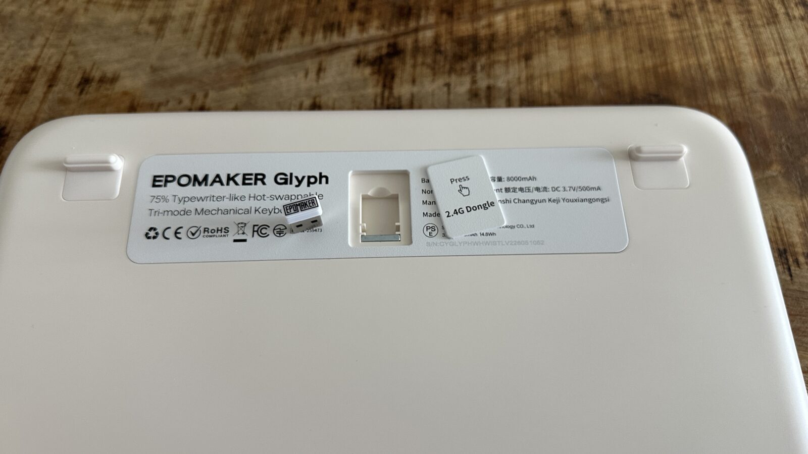
Managing your desk real estate becomes remarkably simple thanks to the comprehensive tri-mode connectivity options baked into this hardware. The Glyph can effortlessly pair with up to three distinct Bluetooth devices, while also offering a low-latency wireless connection via an included USB dongle. For the purists who demand zero latency or simply want to juice up the battery, a heavy-duty wired connection is always available, made extra sweet with the included braided USB-A to USB-C cable in the box. Switching between my primary desktop computer, an iPad resting in the integrated slot, and a work laptop is completely seamless.
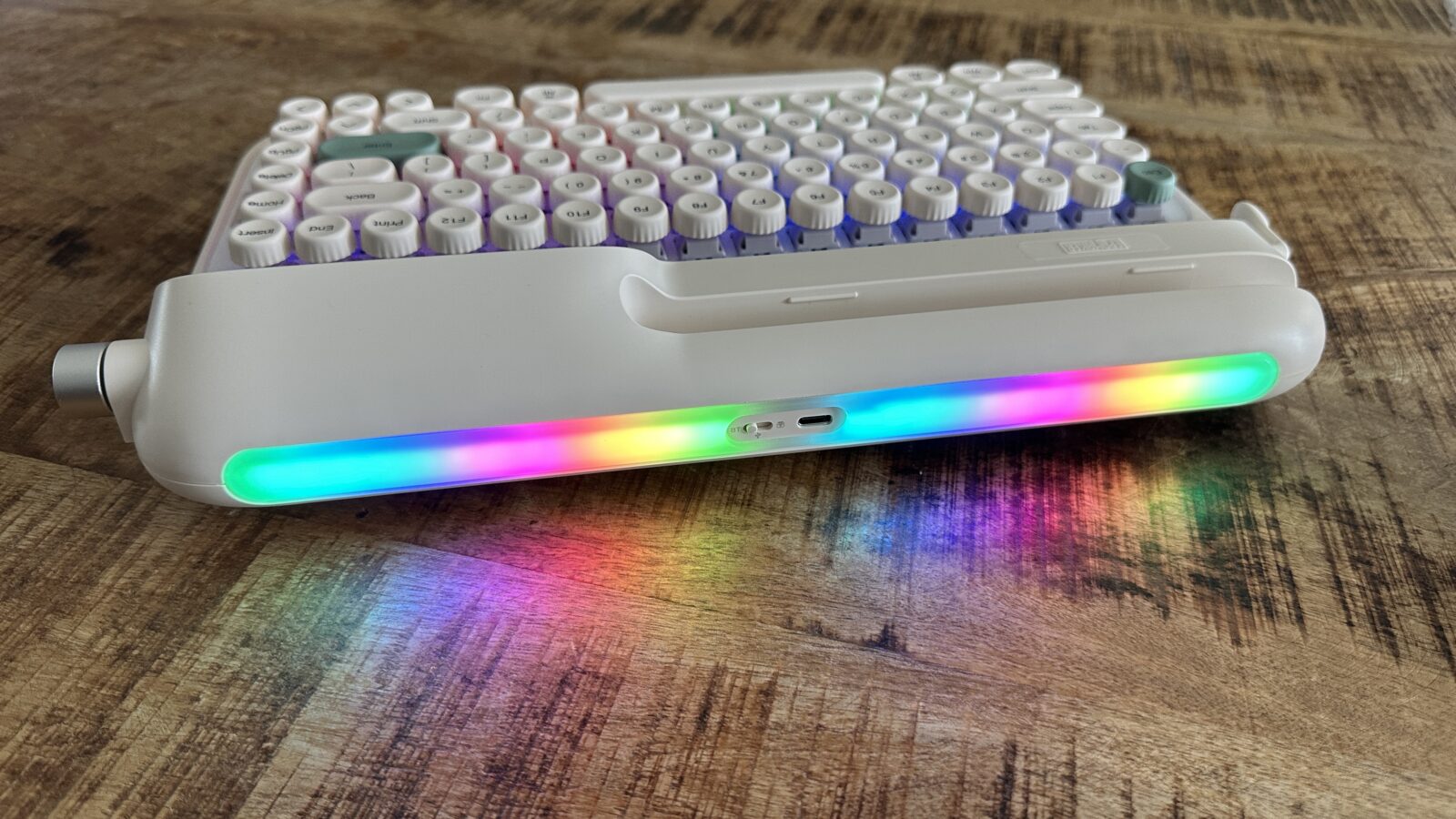
Customization enthusiasts will be pleased to find an elaborate dual-zone lighting layout that illuminates both the keys and the environment. You get a standard per-key backlight array beneath the caps, coupled with an ambient side light strip, it’s called side light, but it’s more at the back, that projects a colorful glow backward against your office wall. Both lighting zones feature a wide variety of preset patterns, animation styles, and custom color wheels. Epomaker has established a lively community hub where users can download shared lighting profiles or construct intricate light shows from scratch, but I was unable to get this to work YMMV.
The best part about this hardware architecture is that you can control almost everything using the tactile media knob and physical key combinations. You can adjust the brightness of both lighting zones and cycle through effects on the fly without ever touching the proprietary desktop application.
The Weight of Retro Glory and Ergonomic Realities
Living with a high-profile mechanical deck over an extended testing period exposes a few notable physical and ergonomic challenges. The physical height of the Glyph is exceptionally tall, sitting significantly higher off the desk surface than almost any traditional keyboard. This aggressive profile means your hands are constantly forced into an elevated position, which can quickly induce forearm fatigue during marathon writing sessions. Even seasoned mechanical keyboard enthusiasts who stopped by my office commented on just how thick this chassis feels in hand.
Contributing to this massive physical footprint is a colossal internal battery that ensures weeks of wireless runtime between charges. This massive battery gives the device an incredibly heavy, anchored feel that prevents it from ever sliding around your desk during intense typing. To help combat the extreme chassis height, Epomaker packages a matching, ultra-thick gel wrist rest inside the box. This wrist rest offers fantastic, pillow-soft support for your carpal bones, preventing sharp pains and providing a much-needed lift for your hands.
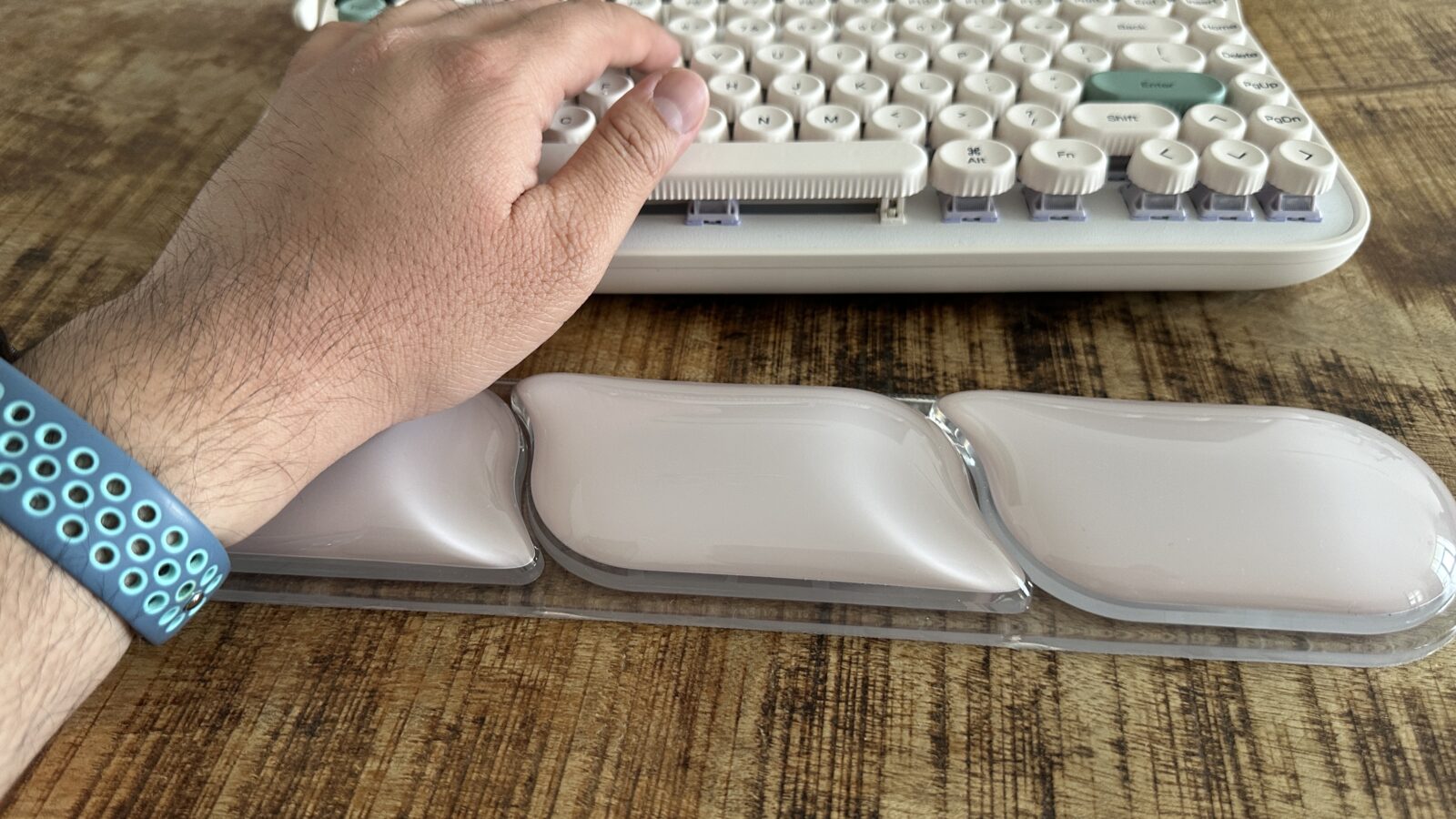
Even with the included cushion deployed, the typing angle remains a bit of a compromise because the integrated feet offer minimal height adjustment, even thought theyt include an extra set of feet in the box. You are essentially locked into a relatively flat, high-altitude typing plane that takes some serious physical adjustment if you are coming from low-profile office decks. It is a classic design trade-off where you willingly sacrifice a bit of modern ergonomic comfort in exchange for maximum vintage aesthetic points. If you value absolute ergonomic perfection above all else, the sheer mass of this unit will definitely push your wrists to their absolute limits.
Verdict
Ultimately, my time spent with the Epomaker Glyph has been an incredibly entertaining ride into the heart of mechanical keyboards. It functions beautifully as a captivating conversation starter, immediately drawing the attention of anyone who happens to glance at my workspace. Discussing the mechanical return lever and the dual embedded screens with tech-adjacent colleagues has made me realize just how much personality this hardware possesses. It bridges the gap for people who are curious about the mechanical hobby but want something far more distinctive than a standard black gaming keyboard.
While the rough software optimization and the uncustomizable nature of the displays represent clear areas for improvement, the core engineering remains undeniably robust.