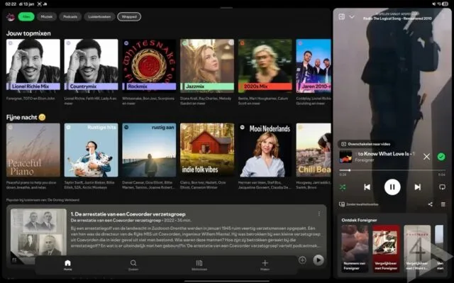
Spotify has begun rolling out a redesigned interface for Android tablets, aiming to better accommodate larger displays and reduce some of the inefficiencies that have lingered in the app’s tablet experience. Rather than introducing new features or services, the update focuses on layout changes that make routine tasks such as browsing, managing playlists, and controlling playback easier to handle on a single screen.
The most noticeable shift is the move away from a full-screen player dominating the interface. On tablets, playback controls are now positioned on the right side of the display, closely resembling how the desktop version of the app is organized. This change addresses a long-standing issue in the previous tablet layout, where oversized playback elements often left unused space and made multitasking awkward. Users can also adjust the size of the player pane, allowing the interface to adapt to different screen sizes and personal preferences.
Navigation has been reworked to take advantage of the wider format. The left side of the screen now consistently shows access points to the user’s library, playlists, and home feed, along with other active sections. Keeping these elements visible at all times reduces the need to jump back and forth between screens, which has traditionally slowed down navigation on tablets compared to phones or desktops. For users who frequently switch between browsing recommendations and managing queues, the layout feels more practical and predictable.
A persistent navigation bar has also been added to the bottom of the screen. This bar provides direct access to core sections such as home, search, and library, mirroring familiar patterns from other large-screen Android apps. A shortcut for creating new playlists is included as well, cutting down the number of steps required to start organizing music. While not a major functional change, it reflects a broader effort to streamline common actions rather than bury them in menus.
Early reports indicate that the updated Android tablet UI is already reaching users running the latest version of the app through the Play Store. The rollout does not appear to be tied to a beta program, though availability may vary as the update is distributed in stages. In parallel, the company is reportedly exploring additional customization options aimed at users who prefer simpler or more restrained visual styles, suggesting further refinements may follow.
For Android tablet owners, this update brings the app closer to a consistent experience across devices, addressing usability gaps without overhauling how the service works.