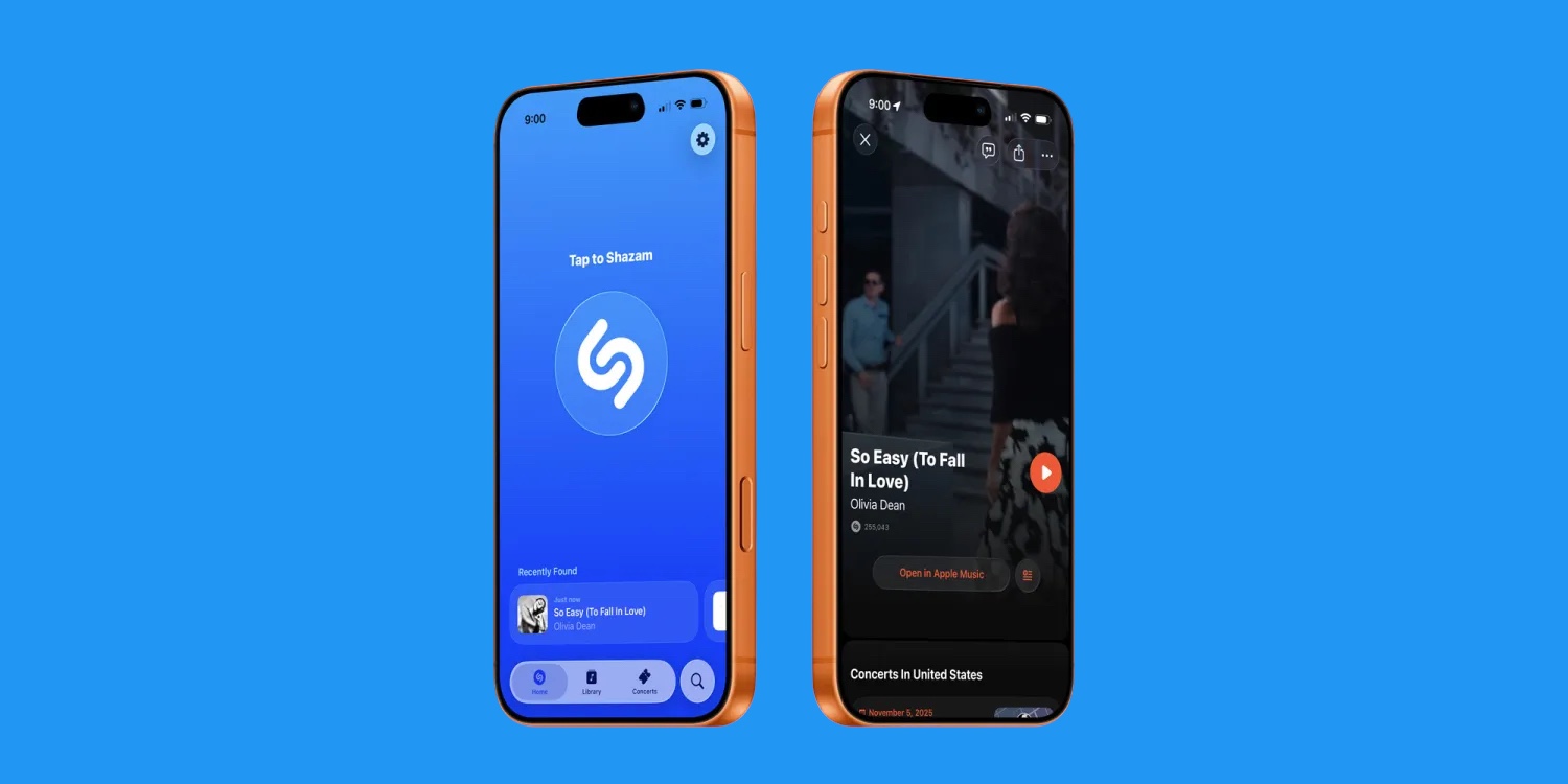
Apple has released a new update for Shazam on iOS, introducing a “Liquid Glass” redesign that brings a more translucent, layered look to the music-recognition app. The refreshed interface aligns Shazam with Apple’s current design language, which emphasizes depth, motion, and soft transparency across its native apps.
The update, now available globally on the App Store, reworks the layout to make navigation simpler and more consistent. A new toolbar at the bottom provides quick access to Home, Library, and Concerts tabs, while Search has been moved to its own dedicated button on the right side. The Home screen also now displays a list of recently identified songs, allowing users to revisit their discoveries without needing to dig through menus.
Apple’s release notes describe the visual overhaul as a “sleek, new Liquid Glass look,” featuring more fluid animations and subtle transparency effects. The app icon has also been updated to match the new aesthetic. While the changes are primarily cosmetic, they bring Shazam visually closer to other Apple services that have adopted the same design approach, including Apple Music and Apple Podcasts.
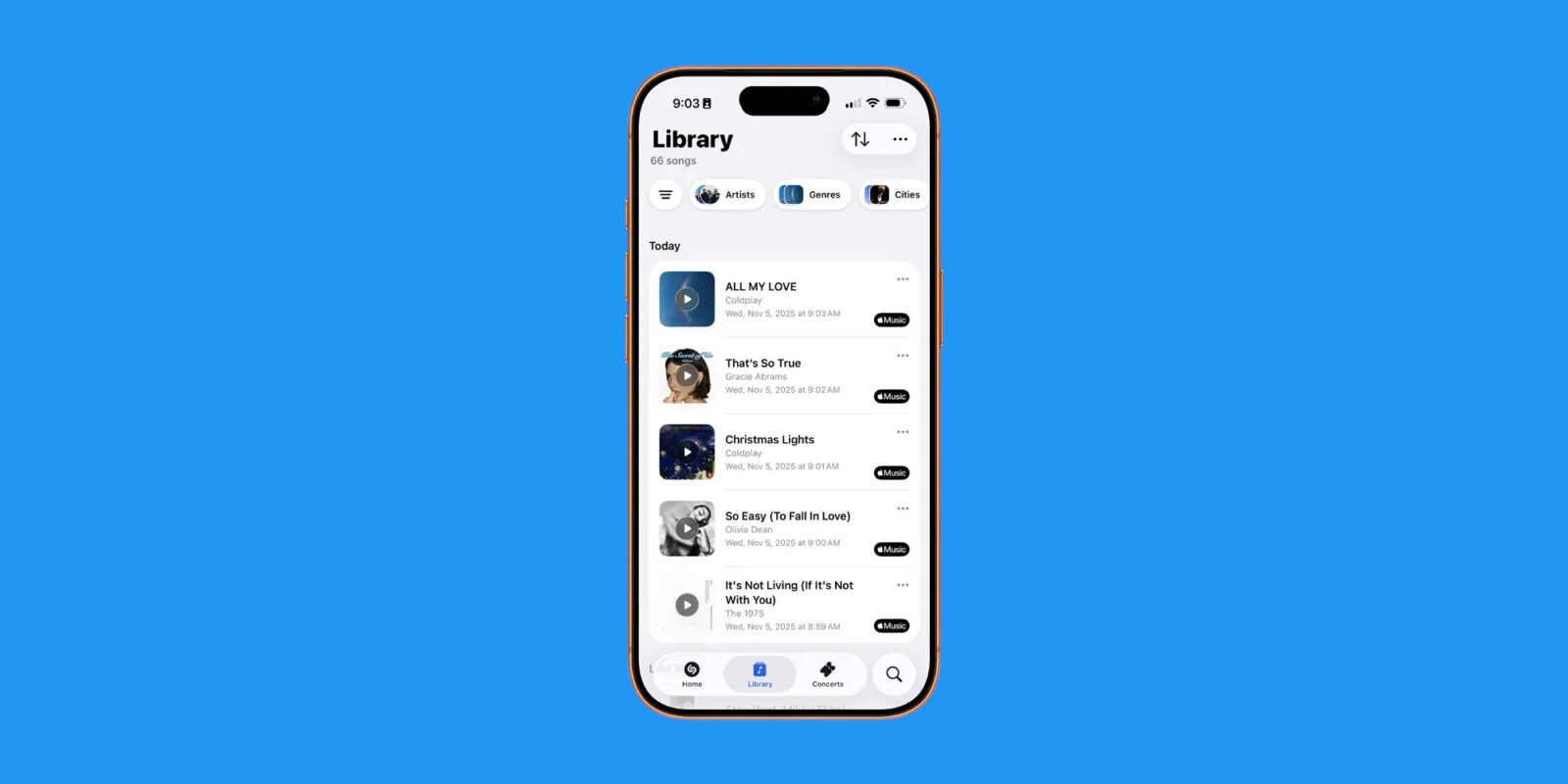
This redesign is part of Apple’s ongoing effort to standardize its app interfaces under a unified aesthetic while refining functionality. The addition of recent songs on the Home tab also signals a small but practical improvement in usability, reducing steps for frequent users who rely on Shazam to keep track of their listening history.
The new version of Shazam requires iOS 26 and is rolling out today through the App Store. Though not a major feature expansion, the update underscores Apple’s continued investment in maintaining Shazam’s integration within the broader Apple Music ecosystem — particularly as music discovery and live event listings remain key elements of Apple’s entertainment strategy.