Opera has updated its iPhone browser with a redesigned tab management system, arriving just ahead of Apple’s iOS 26 rollout and Safari’s Liquid Glass UI refresh. Unlike Apple, which bundles Safari changes into major OS updates, Opera continues to push independent upgrades, pitching itself as a flexible alternative for users who find Safari too limited.
The new system aims to solve one of the most common headaches for mobile browsing: tab overload. Opera says the redesign introduces a more desktop-like feel, giving iPhone users more control over how they view, organize, and search through open pages.
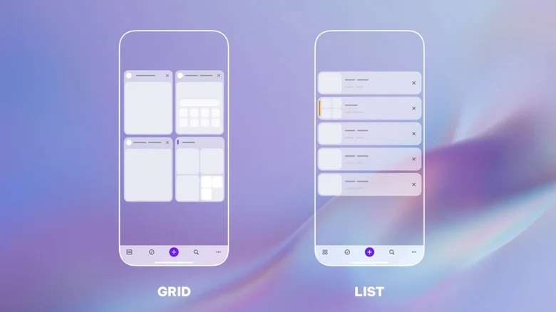
The update introduces grid and list views, letting users choose between a more visual overview of multiple tabs or a compact, scrollable list that can accommodate hundreds of entries. Opera has also added tab grouping, mirroring a popular feature from its desktop browser, so users can cluster tabs by project, theme, or activity—whether it’s planning a trip or managing work research.
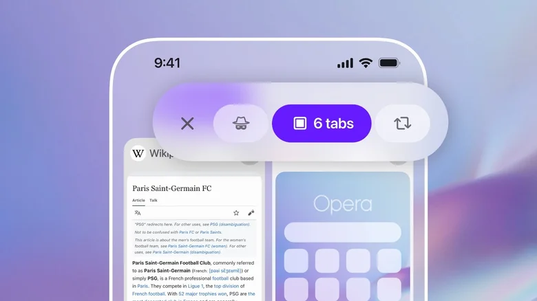
For those prone to hoarding dozens of tabs at once, a new tab search tool allows quick filtering by keyword, scanning both titles and URLs. Opera has also overhauled the UI for faster switching between normal tabs, private browsing, and synced tabs from other devices.
Beyond tab management, Opera for iOS now offers customizable menus to keep favorite features within easy reach, and quicker access to Aria, the browser’s built-in AI assistant, which has been repositioned at the center of the bottom bar for faster use.
Opera’s timing is no accident. With Apple expected to showcase a Safari redesign under iOS 26 in the coming weeks, the Norwegian company is making the case for its browser as the go-to option for users who want advanced features without waiting for OS-level updates. By focusing on everyday pain points like tab clutter, Opera is betting it can win over iPhone users who feel Safari is too tied to Apple’s ecosystem.