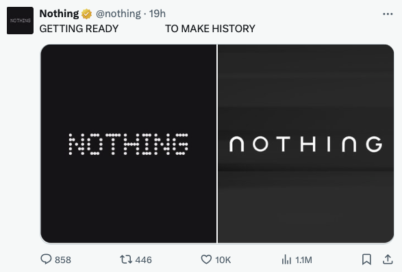
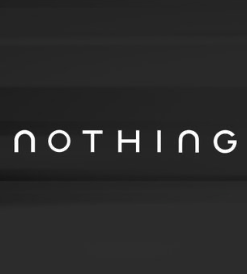
Nothing has confirmed a significant brand identity change, unveiling a new logo through a teaser post on X that immediately sparked discussion across social platforms. The update marks a visible departure from the pixel-based visual language that has defined the smartphone maker since its debut. Two monochrome images accompanying the post reveal a revised wordmark, paired with the tagline “getting ready to make history,” suggesting a broader shift in how the company wants to present itself as it matures.
The teased logo appears cleaner and more conventional, moving away from the dot-matrix aesthetic that helped distinguish Nothing in a crowded consumer electronics market. While the original design was closely tied to the brand’s early positioning as a challenger focused on design-led differentiation, the new direction signals a more restrained and mainstream typographic approach. So far, Nothing has not clarified whether this change applies only to the logo or forms part of a wider brand refresh that could extend to products, packaging, and marketing.

Online reaction was swift and divided. A section of users sees the redesign as a predictable evolution for a company that is expanding its global footprint and appealing to a broader audience. Others argue that stepping away from the pixel identity risks weakening one of the brand’s most recognizable features. Much of the debate, however, has centered on perceived similarities between Nothing’s new wordmark and the recently updated branding of Jaguar.
The comparison gained traction quickly, with side-by-side images circulating and fueling speculation about whether the resemblance was intentional or coincidental. The discussion was amplified by the context of an earlier exchange between the two brands. In 2024, when Jaguar introduced its own rebrand as part of a wider transition toward an all-electric future, the automaker rolled out a new logo, updated fonts, and slogans such as “create exuberant” and “live vivid.” That campaign drew mixed responses, with critics questioning both the visual direction and the messaging.
At the time, Nothing publicly leaned into the conversation with humor, briefly altering its social media presence to parody Jaguar’s new look and tagline. The move was widely shared and reinforced Nothing’s reputation for playful, self-aware marketing. Against that backdrop, the current similarity between the two visual identities has added another layer to the discussion, even if neither company has acknowledged a direct connection.
For now, the redesign leaves more questions than answers. Whether the new logo represents a strategic repositioning or simply a visual update will become clearer once Nothing outlines the full scope of the change. What is certain is that the move has succeeded in drawing attention, reigniting conversation around brand identity, originality, and how design choices are interpreted in an increasingly crowded and visually similar tech landscape.


