Google Maps has received a small but noticeable visual update on both Android and iOS, with a redesigned app icon now rolling out through the latest versions of the app. While the functionality of Google Maps remains unchanged, the refreshed icon gives the long-running navigation app a more contemporary appearance.
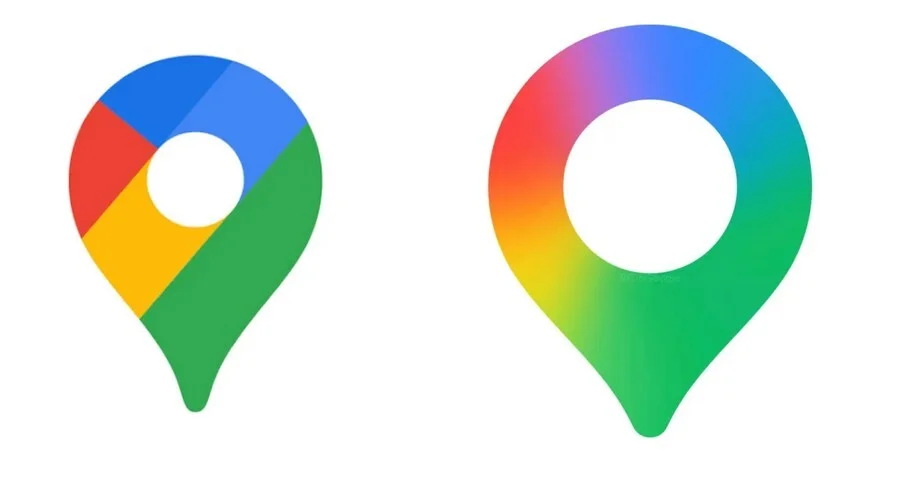
The new Google Maps icon keeps the familiar map pin shape, but the internal design has shifted. Previously, the pin contained distinct color blocks—blue, green, yellow, and red—arranged diagonally. In the updated version, those colors transition into one another using a smoother gradient. The pin itself appears slightly larger, and the circular cutout in the center has also been expanded, resulting in a thinner ring at the top. The overall effect is cleaner and more in line with Google’s current design language, which favors blended gradients over sharply separated color segments.
This isn’t the first time Google Maps has changed its icon. The earliest version on the original iPhone featured intersecting road lines, a red location pin, and a Highway 280 marker. Later iterations introduced a folded map design with a red pin and a small “G” in the corner. Over time, that evolved into the simplified standalone pin that Android users in particular have come to associate with Google Maps. The 2026 redesign builds on that established shape rather than replacing it outright.
The new icon is appearing in version 26.09.06.873668274 of Google Maps for Android and version 26.09.5 for iOS. Users who don’t immediately see the updated icon may need to manually check for an update.
On Android, open the Google Play Store, tap your profile icon, select “Manage apps & device,” and check for available updates. If Google Maps appears in the list, install the update to trigger the new icon. On iOS, open the App Store, tap your profile icon, and scroll through pending updates. If the icon doesn’t change after updating, refreshing the updates page and checking again may reveal a secondary patch.
Although the update is cosmetic, Google Maps remains one of Google’s most widely used apps across both platforms. It has evolved significantly since its early days, especially with the addition of turn-by-turn navigation, which became a major feature on Android devices in 2009 and arrived on iPhone later as a standalone app.
The redesigned Google Maps icon reflects Google’s ongoing effort to modernize its app ecosystem visually, even when core features remain stable. For most users, the change is subtle—but on a crowded home screen, it’s immediately noticeable.