Microsoft is rolling out a new look for its Microsoft 365 suite, giving some of the most familiar app icons in tech their first refresh in seven years. The update affects nine of its core services — Defender, Excel, OneDrive, OneNote, Outlook, PowerPoint, SharePoint, Teams, and Word — and will appear gradually on Windows PCs in the coming weeks.
The redesign marks the biggest visual shift since 2018, when Microsoft last reworked its Office icons. This time, the company has softened the sharp, blocky designs in favor of more fluid shapes and curves. The update also leans into bolder color palettes, bringing a brighter, more modern look across the suite.
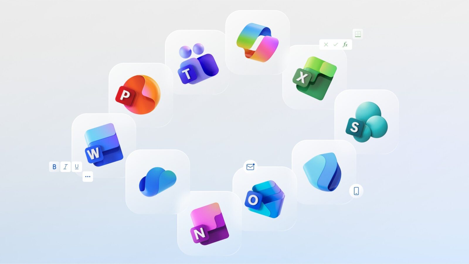
Jon Friedman, Microsoft’s corporate vice president of design and research, described the new approach as aiming for “playful motion and approachability.” According to Friedman, the design team even debated removing the familiar letter-based logos from apps like Word and OneNote, but ultimately decided their recognition was too valuable to abandon. Instead, the letters were integrated into a more cohesive design system inspired in part by Microsoft’s Copilot iconography, first introduced in 2023.
The Copilot influence is intentional. Microsoft has positioned AI as central to the future of its productivity tools, and the new visuals are meant to reflect that shift. Friedman called the icons “a reflection and a result of Copilot’s transformative impact,” framing the redesign as both a modernization effort and a nod to Microsoft’s broader AI strategy.
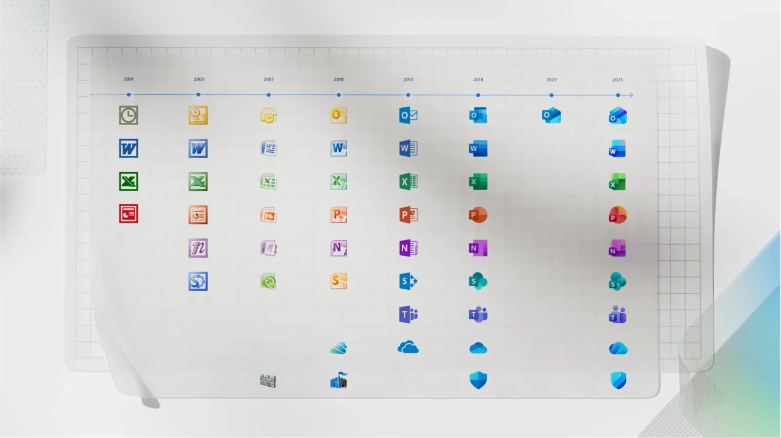
For long-time users, this is one of the longest stretches Microsoft has gone without refreshing its app logos. The 2018 set lasted seven years, outlasting the previous record of five years between the 2003 and 2007 redesigns. Outlook is a small exception, having received a minor tweak in 2023.
The new look also underscores Microsoft’s balancing act between heritage and reinvention. While the icons have been streamlined and re-colored to align with current design trends, they remain instantly recognizable to the hundreds of millions of people who rely on them daily.
The update comes as Microsoft is leaning heavily into nostalgia as well. Alongside this redesign, the company recently unveiled novelty Windows XP Crocs — complete with charms of Clippy and the Internet Explorer logo — as part of its 50th anniversary.
For users, the refreshed icons will simply arrive as updates roll out, meaning many will notice their taskbar and desktop slowly shifting toward Microsoft’s latest design language over the next several weeks.