By using this site, you agree to our Privacy Policy and Terms of Service.
Accept
Absolute Geeks UAEAbsolute Geeks UAE
  • STORIES
    • TECH
    • AUTOMOTIVE
    • GUIDES
    • OPINIONS
  • REVIEWS
    • READERS’ CHOICE
    • ALL REVIEWS
    • ━
    • SMARTPHONES
    • CARS
    • HEADPHONES
    • ACCESSORIES
    • LAPTOPS
    • TABLETS
    • WEARABLES
    • SPEAKERS
    • APPS
  • WATCHLIST
    • TV & MOVIES REVIEWS
    • SPOTLIGHT
  • GAMING
    • GAMING NEWS
    • GAME REVIEWS
  • +
    • OUR STORY
    • GET IN TOUCH
Reading: Google updates its iconic “G” logo with brighter colors and gradients
Share
Notification Show More
Absolute Geeks UAEAbsolute Geeks UAE
  • STORIES
    • TECH
    • AUTOMOTIVE
    • GUIDES
    • OPINIONS
  • REVIEWS
    • READERS’ CHOICE
    • ALL REVIEWS
    • ━
    • SMARTPHONES
    • CARS
    • HEADPHONES
    • ACCESSORIES
    • LAPTOPS
    • TABLETS
    • WEARABLES
    • SPEAKERS
    • APPS
  • WATCHLIST
    • TV & MOVIES REVIEWS
    • SPOTLIGHT
  • GAMING
    • GAMING NEWS
    • GAME REVIEWS
  • +
    • OUR STORY
    • GET IN TOUCH
Follow US

Google updates its iconic “G” logo with brighter colors and gradients

GEEK DESK
GEEK DESK
Sep 30

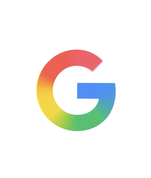
Google is giving its familiar “G” logo a fresh update, expanding the brighter, four-color gradient design it introduced earlier this year for Search to now serve as the company-wide symbol. The move marks the first major adjustment to Google’s primary icon since 2015, when the current four-color “G” was introduced alongside a broader logo redesign.

The new version retains the recognizable blue, red, yellow, and green palette but shifts toward more vivid tones with a subtle gradient. According to Google, the change is meant to capture the company’s ongoing shift in focus toward artificial intelligence while maintaining continuity with its established visual identity. The design first appeared with Gemini, Google’s AI suite, in June and will gradually be rolled out across products, apps, and services in the coming months.

Corporate logo updates tend to invite scrutiny, especially for brands as ubiquitous as Google. The company is framing this iteration not as a break from tradition but as an evolution — a way to modernize its appearance while acknowledging how central AI has become to its business. By leaning on gradients and brighter hues, the updated icon aims to feel more dynamic and in step with the visual styles that dominate tech branding in 2025.

Whether users notice the change beyond its initial rollout is another question. Google’s visual refreshes have historically been subtle, with continuity playing a central role in maintaining familiarity across billions of users and devices. But even small adjustments can be significant for a company that uses its logo as a constant presence across hardware, software, and services worldwide.

Share
What do you think?
Happy0
Sad0
Love0
Surprise0
Cry0
Angry0
Dead0

WHAT'S HOT ❰

UAE dirham symbol approved for unicode, arriving on keyboards in 2026
Paramount to acquire Warner Bros Discovery in $110 billion media merger
ChatGPT nears 1 billion weekly users as OpenAI reports 900m milestone
Nintendo reveals $70 Game Boy Jukebox for Pokémon’s 30th anniversary
Nothing Headphone (a) confirmed for March 5 with bold yellow finish
Absolute Geeks UAEAbsolute Geeks UAE
Follow US
AbsoluteGeeks.com was assembled by Absolute Geeks Media FZE LLC during a caffeine incident.
© 2014–2026. All rights reserved.
Proudly made in Dubai, UAE ❤️
Upgrade Your Brain Firmware
Receive updates, patches, and jokes you’ll pretend you understood.
No spam, just RAM for your brain.
Welcome Back!

Sign in to your account

Username or Email Address
Password

Lost your password?