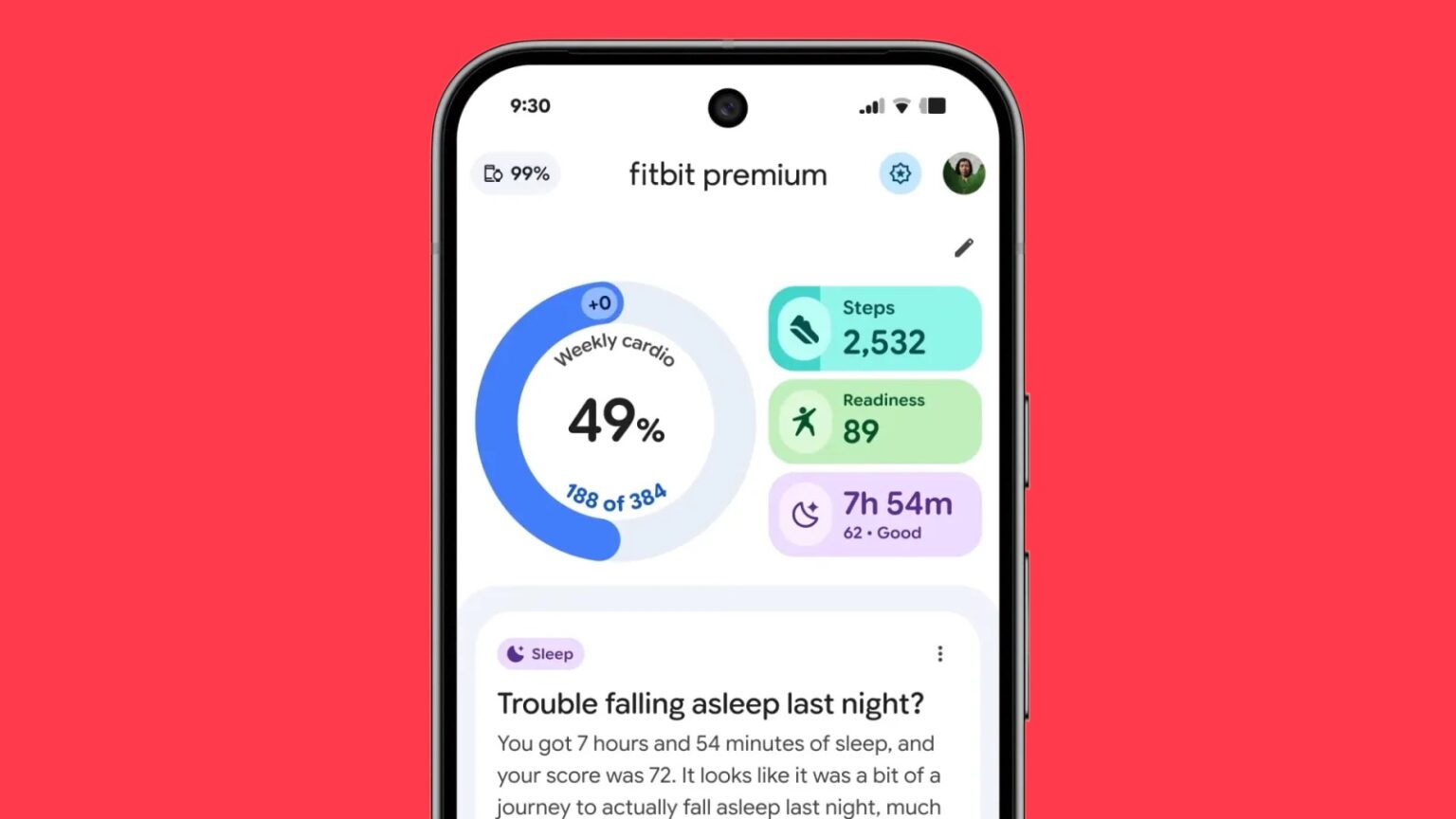
Fitbit’s long-anticipated redesign has started rolling out to select users, giving the health and fitness app a fresh look built on Google’s Material 3 Expressive (M3E) design system. The update, which is currently available to Fitbit Premium users in the United States as part of a public preview, marks the most significant visual overhaul of the app since Google acquired Fitbit in 2021.
The redesign introduces smoother layouts, softer animations, and more intuitive navigation consistent with other Google apps that have adopted the Material 3 style. The bottom navigation bar is now shorter, and syncing a Fitbit tracker or Pixel Watch can be done with a simple pull-down gesture from any of the app’s main tabs. The new circular sync animation and progress bar replace the old “Fitbit Premium” header, offering a cleaner and more fluid experience.
Each section of the app — Today, Fitness, and Sleep — now uses layered, card-based layouts with expressive background colors: teal for Fitness and purple for Sleep. Metrics such as Steps and Sleep include a floating toolbar that lets users toggle between different time frames (Day, Week, Month, 3 Months, or Year). A floating action button provides quick access to the AI-powered personal health coach, which Google introduced earlier this year under the Gemini branding.
While the overall experience feels more cohesive, the preview still lacks Dynamic Color support — the system-level theming feature that adapts an app’s colors to match a user’s wallpaper. For now, Fitbit retains its traditional blue accent, though future updates could bring more personalization options to match the rest of Google’s Material You ecosystem.
This redesign is more than cosmetic. Fitbit’s app is the core of its user experience, housing all activity tracking, sleep metrics, and health insights. Bringing it in line with Google’s design language is a step toward unifying Fitbit with other products in the company’s health ecosystem, including the Pixel Watch and Android Health Connect.
Early impressions from users suggest the new interface feels more modern, though some find it slightly cluttered — a common challenge when visual updates aim to balance style with usability. As the rollout continues ahead of a wider release next year, Google will likely refine animations, spacing, and feature placement based on user feedback.
For now, Fitbit Premium subscribers get the first look at where the brand is headed: a more expressive, interconnected health platform that better reflects Google’s design philosophy while still maintaining Fitbit’s familiar functionality.


