By using this site, you agree to our Privacy Policy and Terms of Service.
Accept
Absolute Geeks UAEAbsolute Geeks UAE
  • STORIES
    • TECH
    • AUTOMOTIVE
    • GUIDES
    • OPINIONS
  • REVIEWS
    • READERS’ CHOICE
    • ALL REVIEWS
    • ━
    • SMARTPHONES
    • CARS
    • HEADPHONES
    • ACCESSORIES
    • LAPTOPS
    • TABLETS
    • WEARABLES
    • SPEAKERS
    • APPS
  • WATCHLIST
    • TV & MOVIES REVIEWS
    • SPOTLIGHT
  • GAMING
    • GAMING NEWS
    • GAME REVIEWS
  • +
    • OUR STORY
    • GET IN TOUCH
Reading: Google Maps is rolling out another redesign, focusing on pin shape and colors
Share
Notification Show More
Absolute Geeks UAEAbsolute Geeks UAE
  • STORIES
    • TECH
    • AUTOMOTIVE
    • GUIDES
    • OPINIONS
  • REVIEWS
    • READERS’ CHOICE
    • ALL REVIEWS
    • ━
    • SMARTPHONES
    • CARS
    • HEADPHONES
    • ACCESSORIES
    • LAPTOPS
    • TABLETS
    • WEARABLES
    • SPEAKERS
    • APPS
  • WATCHLIST
    • TV & MOVIES REVIEWS
    • SPOTLIGHT
  • GAMING
    • GAMING NEWS
    • GAME REVIEWS
  • +
    • OUR STORY
    • GET IN TOUCH
Follow US

Google Maps is rolling out another redesign, focusing on pin shape and colors

GEEK DESK
GEEK DESK
Aug 28

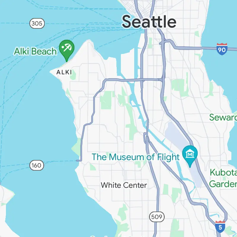
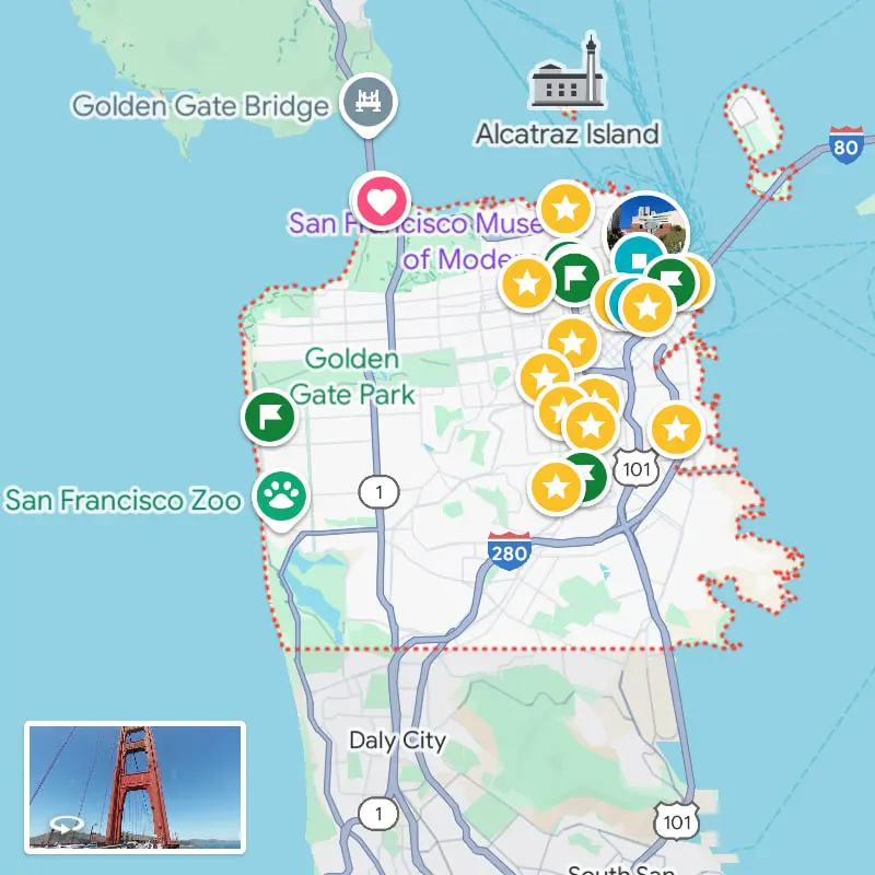
Google Maps, the go-to navigation app for millions around the world, is undergoing a subtle yet impactful transformation.The iconic teardrop-shaped pin, a staple of the app’s visual language for years, is being retired in favor of a more modern and streamlined design.

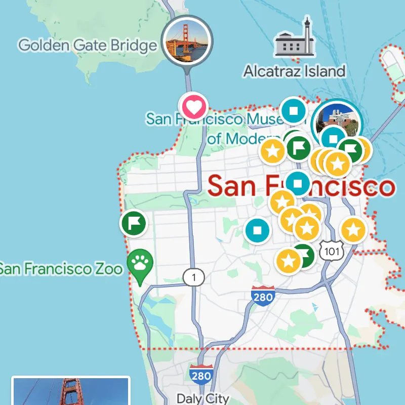
The new pin, shorter and rounder than its predecessor, features a clean white background with a colored inner circle that houses the category icon. This design change aligns the pin with the existing aesthetic of other icons within the app, such as stars, flags, and hearts, creating a more cohesive and visually pleasing experience.

OLD
NEW

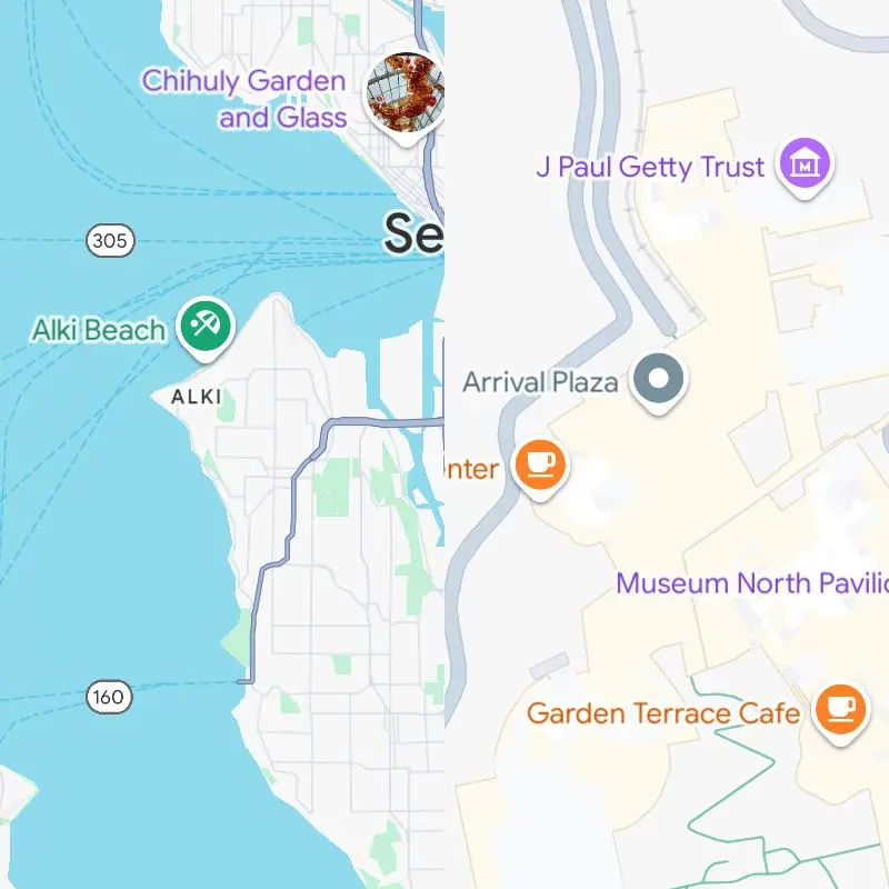
While the shape and overall look of the pins have been updated, most categories retain their familiar colors. However,some categories, like museums, have been assigned new hues, adding a touch of freshness to the map. Additionally, the redesign includes subtle tweaks to other colors and text elements, making them appear lighter and more contemporary.

This seemingly minor change could have a significant impact on the user experience. The shorter pin design might allow Google to display more pins on the map at once without causing visual clutter, especially in densely populated areas. This would make it easier for users to quickly identify and navigate to their desired destinations.

OLD
NEW

The redesigned pins are currently being rolled out to Android, iOS, and web users, so you may start noticing the new look in your Google Maps app soon. While some may mourn the loss of the classic pin, this update is a testament to Google’s commitment to continually refining and improving its products, ensuring that Google Maps remains the most user-friendly and visually appealing navigation tool available.

Share
What do you think?
Happy0
Sad0
Love0
Surprise0
Cry0
Angry0
Dead0

WHAT'S HOT ❰

Elevenlabs enters AI music with a text-to-song app on iOS
Mercedes EQS introduces steer-by-wire: what changes for drivers
Anghami hosts cross-border Arab music release
UAE approves new oral weight-loss pill as alternative to injections
HONOR Magic8 Pro Professional Imaging Kit enhances mobile photography
Absolute Geeks UAEAbsolute Geeks UAE
Follow US
AbsoluteGeeks.com was assembled by Absolute Geeks Media FZE LLC during a caffeine incident.
© 2014–2026. All rights reserved.
Proudly made in Dubai, UAE ❤️
Upgrade Your Brain Firmware
Receive updates, patches, and jokes you’ll pretend you understood.
No spam, just RAM for your brain.
Welcome Back!

Sign in to your account

Username or Email Address
Password

Lost your password?