Apple has refreshed its developer-facing design gallery to highlight how third-party apps are adopting its Liquid Glass interface approach. The update marks a continuation of the company’s effort to encourage a more unified visual language across its platforms, following the gallery’s initial rollout late last year.
The Liquid Glass design system emphasizes layered transparency, motion, and responsiveness, aiming to create interfaces that feel more fluid and adaptive. While Apple presents it as a way to improve usability and visual consistency, early reactions from developers and users suggest the results vary depending on implementation. Some apps benefit from a cleaner layout and more modern presentation, while others raise concerns around readability and visual clarity—issues that have historically accompanied transparency-heavy interfaces.
Among the apps featured in the updated gallery is Carrot Weather, which incorporates the design changes into elements like its radar maps and navigation structure. The redesign includes a simplified interface with fewer tabs, reflecting a broader trend toward reducing on-screen complexity in mobile apps. Denim, an app focused on creating playlist artwork, is also highlighted for integrating Liquid Glass elements into its editing tools, particularly through subtle blending effects and updated control layouts.
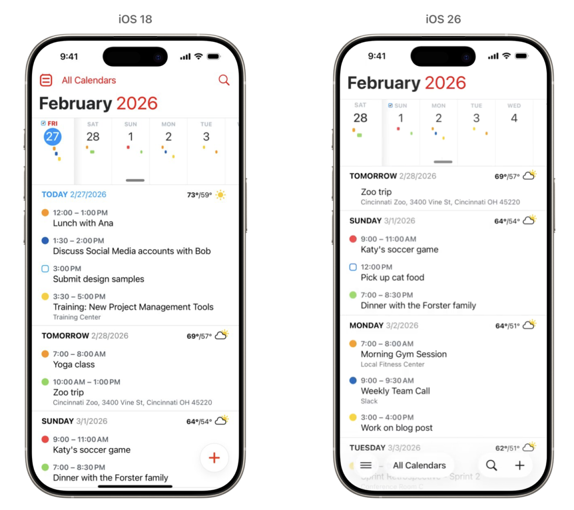
Other apps included in the showcase—such as Tasks, GoodLinks, AllTrails, and Fantastical—demonstrate a range of approaches to the design language. In some cases, the changes are relatively minimal, focusing on updated controls and visual polish. In others, the adoption is more pronounced, affecting how users interact with content and navigate the interface.
Apple’s decision to spotlight third-party implementations suggests it is relying on developers to refine how Liquid Glass works in practice. This is not unusual; platform-wide design shifts often depend on external adoption to mature beyond initial guidelines. At the same time, feedback from early adopters indicates that achieving a balance between visual appeal and usability remains an ongoing challenge.
The update also reflects Apple’s broader push to keep its ecosystem visually cohesive across devices, particularly as apps increasingly span iPhone, iPad, and Mac. Whether Liquid Glass becomes a lasting standard or evolves further will likely depend on how developers address current limitations, especially around accessibility and readability.
The full gallery is available through Apple’s developer website, offering before-and-after comparisons that illustrate how different teams are interpreting the design system. For now, the collection serves less as a definitive statement and more as a snapshot of an interface style still in transition.