Apple’s Liquid Glass design might be one of the most polarizing things the company has done since removing the headphone jack — yet somehow, Android manufacturers can’t seem to get enough of it. Realme is the latest to jump on the glossy, transparent bandwagon with its new Realme UI 7.0, proving once again that imitation isn’t just flattery — it’s apparently a design strategy.
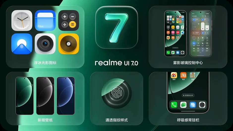
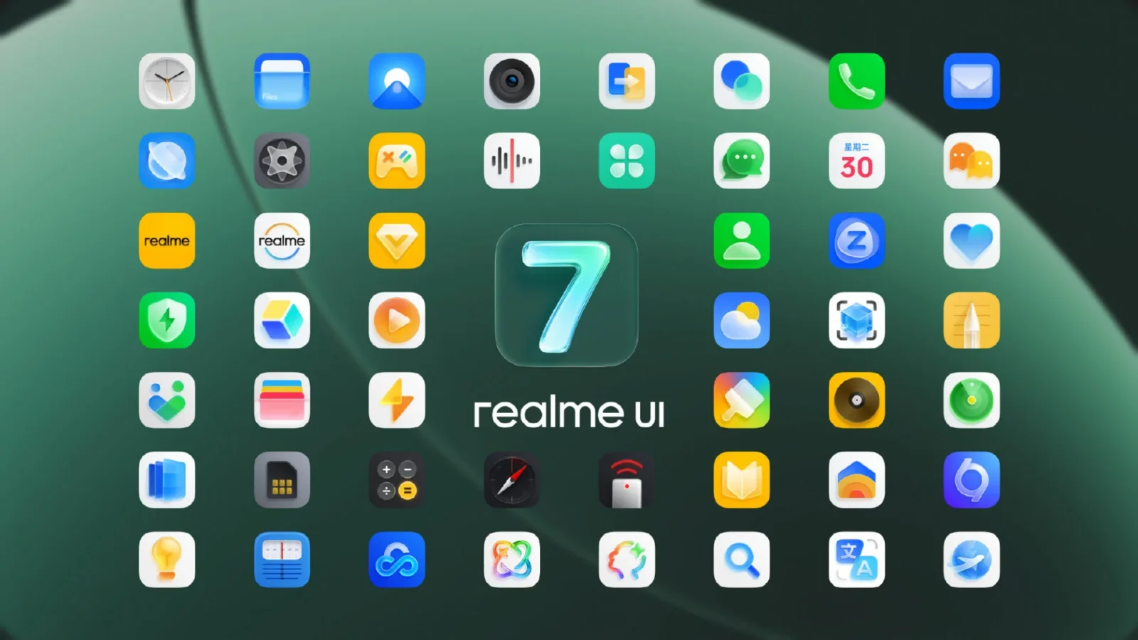
Realme UI 7.0, built on Android 16, introduces something called “Light Glass Design,” which sounds fancy until you realize it’s basically Apple’s iOS 26 in a different color palette. The update comes packed with “Ice Cube Icons” (no, not the rapper) that shimmer and reflect light “like glass,” because that’s exactly what your phone needed — icons pretending to be household objects. There’s also a “Misty Glass Control Center” and a “Breathing Dock,” names that sound less like phone features and more like spa treatments for overworked smartphones.
If that’s not enough, Realme decided to sprinkle in some AI for good measure. “AI Notify Brief” will tell you what your notifications say, but only twice a day — perfect for people who think constant updates are a sign of weakness. “AI Framing Master” teaches you how to take pictures, and “AI Gaming Coach” apparently tells you how bad you are at mobile games.
This new look will debut with the Realme GT8 Pro, before eventually trickling down to other devices — because nothing says “exclusive design” like everyone getting it a few weeks later.
And of course, Realme’s not alone in this copycat crusade. Vivo’s upcoming OriginOS 6 has a “flowing water” design that somehow looks suspiciously like Apple’s Liquid Glass (but sure, let’s call it original). Meanwhile, Samsung’s One UI 8.5, expected with the Galaxy S26, is rumored to be full of “inspired” interface elements. Translation: more shiny icons and blurry panels.
The funniest part? Apple fans weren’t even that into Liquid Glass to begin with. Many found it distracting, overdone, and, frankly, exhausting to look at. But that hasn’t stopped Android brands from sprinting toward the same aesthetic cliff, hoping for the same “premium” vibe that Apple’s marketing machine managed to sell — even if nobody asked for it.
In the end, Realme’s Light Glass Design might be beautiful, derivative, or both. But at least it proves one thing: no matter how weird Apple gets, the rest of the smartphone world will be right there behind it, holding a slightly shinier mirror.