TL;DR: macOS Tahoe 26 is ambitious, fun, and full of features that actually matter. The Liquid Glass design isn’t for everyone, but the productivity gains and performance improvements make this a must-install for Apple silicon users. Intel folks, enjoy the ride while it lasts.
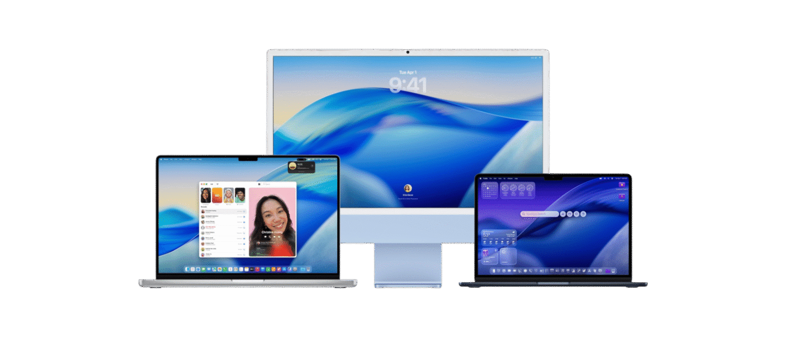
macOS Tahoe 26
I’ve been living inside macOS Tahoe 26 for weeks now, long enough for the newness to wear off and the quirks to show themselves. This is no longer the breathless “wow” of a beta install where half the fun is breaking things; this is the day-to-day reality of using Apple’s latest operating system as my main digital habitat. And honestly? I’m surprised at how much of Tahoe has stuck with me, how much it has changed the way I use my Mac, and how often I find myself both rolling my eyes and grinning at Apple’s boldness in the same session.
macOS Tahoe 26 isn’t a small update. It’s not Monterey’s safe refinement, nor Ventura’s half-step experiments. It’s Apple taking a leap again, a leap in both aesthetics and functionality, and the landing isn’t always graceful. But it’s ambitious, it’s fun, and it’s probably the most exciting macOS release in over a decade. Let’s dig into the translucent rabbit hole Apple has thrown us into.
The Liquid Glass Era: Design and Aesthetics
When Apple announced the “Liquid Glass” design language at WWDC, I rolled my eyes. Apple loves to coin design names that sound like they came out of a perfume ad. But after using it for weeks, I can say this: Liquid Glass is not just a skin-deep refresh. It genuinely changes how macOS feels in daily use.
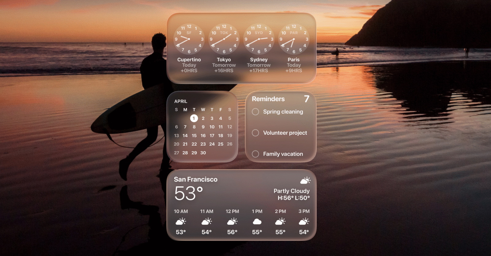
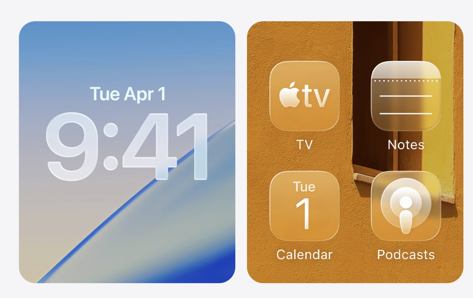
The translucency effect is everywhere now. Menu bars float like holograms, toolbars have detached themselves from the tyranny of borders, and the Dock feels like a physical object rather than a row of icons. On dark wallpapers, it’s gorgeous. The subtle glow, the glassy layering, the sense that windows occupy physical space — it’s like using a Star Trek LCARS interface that got a 2025 makeover. On bright wallpapers, though, it can turn into a smeared mess, like someone rubbed chapstick across your display. Shadows don’t always play nice, legibility suffers, and sometimes I feel like I’m working through frosted bathroom glass.
The thing is, even when it’s awkward, it feels alive. That’s new for macOS. For years, the system’s design language has leaned on static minimalism — clean, flat, almost sterile. Tahoe injects movement and depth, even if it sometimes stumbles. I find myself customizing more than ever because Apple finally loosened its grip on personal expression. Folder tints, icon colors, emojis on everything — this is the most fun I’ve had personalizing macOS since I discovered ShapeShifter back in the early 2000s. My “Projects” folder has a little dragon emoji now. It makes me smile every time I drag a file into it. That’s not productivity, that’s personality, and it matters.
Control Center and the Menu Bar, those long-neglected siblings of iOS imports, finally feel like they belong. I can rearrange, remove, or reskin them entirely. My Menu Bar no longer looks like a parade of squatters fighting for space. Instead, it’s lean, organized, and actually mine. For an OS that has always prided itself on elegance, Apple finally remembered that elegance also comes from flexibility.
Do I wish Apple had gone further? Yes. The translucency sometimes feels like a half-measure, as if the designers couldn’t decide between going full glass cathedral or keeping it safe. And don’t get me started on the inconsistency between system apps and third-party ones — some play beautifully with Liquid Glass, others look like they time-traveled in from Yosemite. But overall, this is the first time in years that macOS feels fresh again. Not just refined, but reborn.
Spotlight: From Search Bar to Command Center
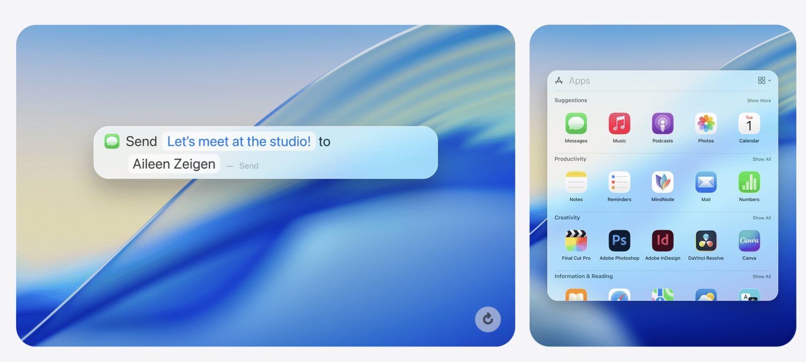
Spotlight has always been the feature I used to impress Windows friends. “Look,” I’d say, “I can just type the name of a file, and boom, there it is.” Of course, those same friends would roll their eyes and point to Windows Search or third-party launchers. Spotlight was good, but it wasn’t special. In Tahoe, Spotlight is special.
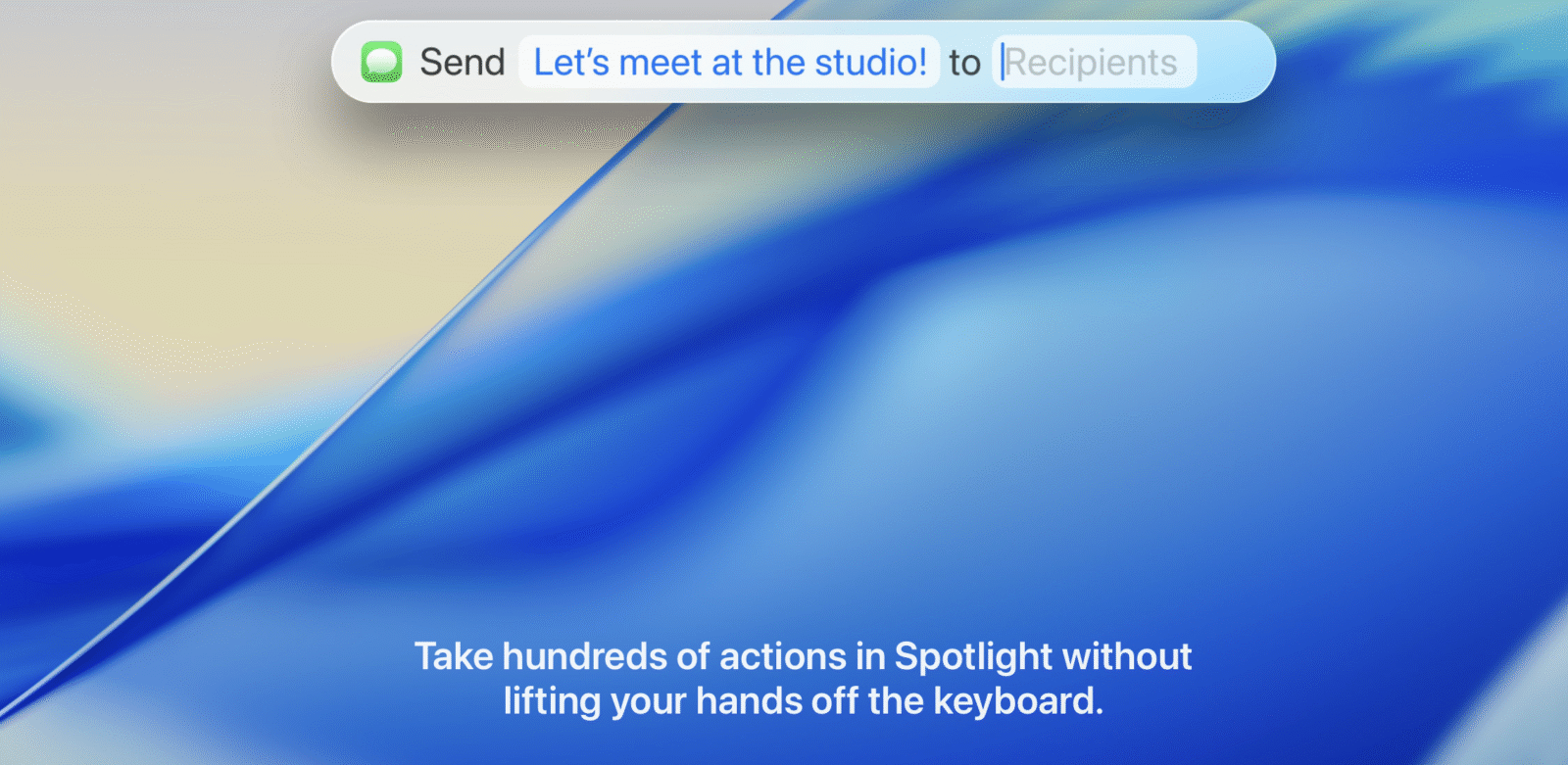
This is no longer just a search bar. It’s a launcher, a clipboard manager, a shortcut trigger, and in many ways, the nervous system of the Mac. When I hit Command + Space now, I don’t just summon files. I summon actions. I can ask Spotlight to play a song, run a shortcut that renames and organizes files, fetch clipboard history, or launch apps without ever seeing the Dock. It’s like Apple finally realized that Spotlight could be macOS’s version of the Terminal for normal people — powerful, invisible, and everywhere.
The clipboard history feature alone has saved me countless headaches. I’m a writer. My days are an endless cycle of copying, pasting, re-copying, and losing the thing I just copied. Tahoe turns Spotlight into a time machine for my clipboard. No more panic when I overwrite something important. No more juggling third-party clipboard managers. It’s all right there, system-integrated, fast, and reliable.
I’ve started using Spotlight for things I never imagined. Adjusting settings. Running automations. Even launching into specific system functions like Wi-Fi networks or Bluetooth devices. The key difference is speed. It’s instant now, like Spotlight finally hit the gym and came back shredded. And because it’s baked in, it feels native in a way no third-party solution ever quite achieved.
Spotlight has gone from a nice-to-have to a can’t-live-without. It’s the biggest quality-of-life change in Tahoe, and the one I’ll miss most when I use older Macs. In fact, I already feel naked using my work-issued Ventura machine, fumbling for features Spotlight made second nature.
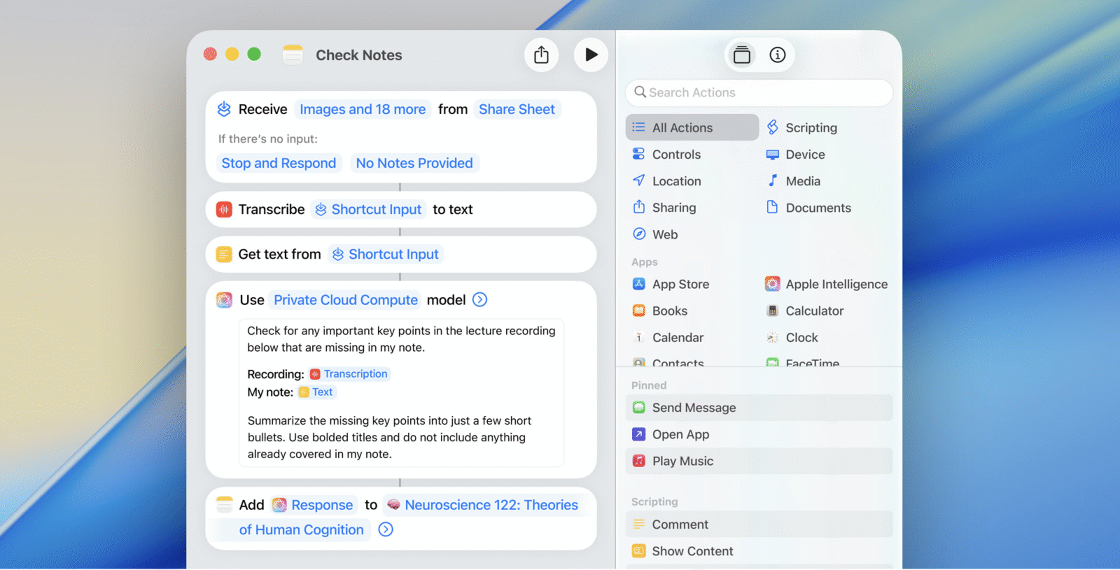
Shortcuts Grow Up
I’ve had a complicated relationship with Shortcuts. On iOS, it’s brilliant. On macOS, it always felt like a clumsy transplant, never quite sure how to live outside the iPhone’s sandbox. Tahoe finally fixes that.
Context-sensitive triggers are the game-changer. I can set automations that trigger based on conditions in the real world. Plug in an external monitor? My Mac switches into Work Focus, launches Slack, opens my to-do list, and sets my wallpaper to something suitably corporate. Disconnect the monitor? Boom, I’m back in personal mode, Spotify open, games folder pinned to the Dock, wallpaper swapped to some ridiculous anime background. It’s like living with a digital butler who knows when I’m working and when I’m playing.
File management has become effortless. Anything dropped into Downloads gets auto-sorted into Documents, Photos, or Archives depending on type. My desktop, once a chaotic graveyard of screenshots, is now a neatly organized grid. The time I’ve saved not dragging and dropping things manually could probably power a small city.
Performance is the other big win. Shortcuts no longer lag like a hungover wizard trying to remember a spell. They fire instantly, smoothly, without drama. For the first time, Shortcuts on macOS feels like a first-class citizen instead of an awkward cousin.
It’s still not perfect. The editor remains fiddly, and Apple could do more to make creating complex workflows less intimidating. But for power users, this is a dream. Tahoe is the release where Shortcuts stops being a toy and becomes a tool.
Continuity Supercharged
Apple’s dream has always been to make the Mac feel less like a standalone computer and more like a node in the Apple hive. Tahoe gets closer to that dream than ever.
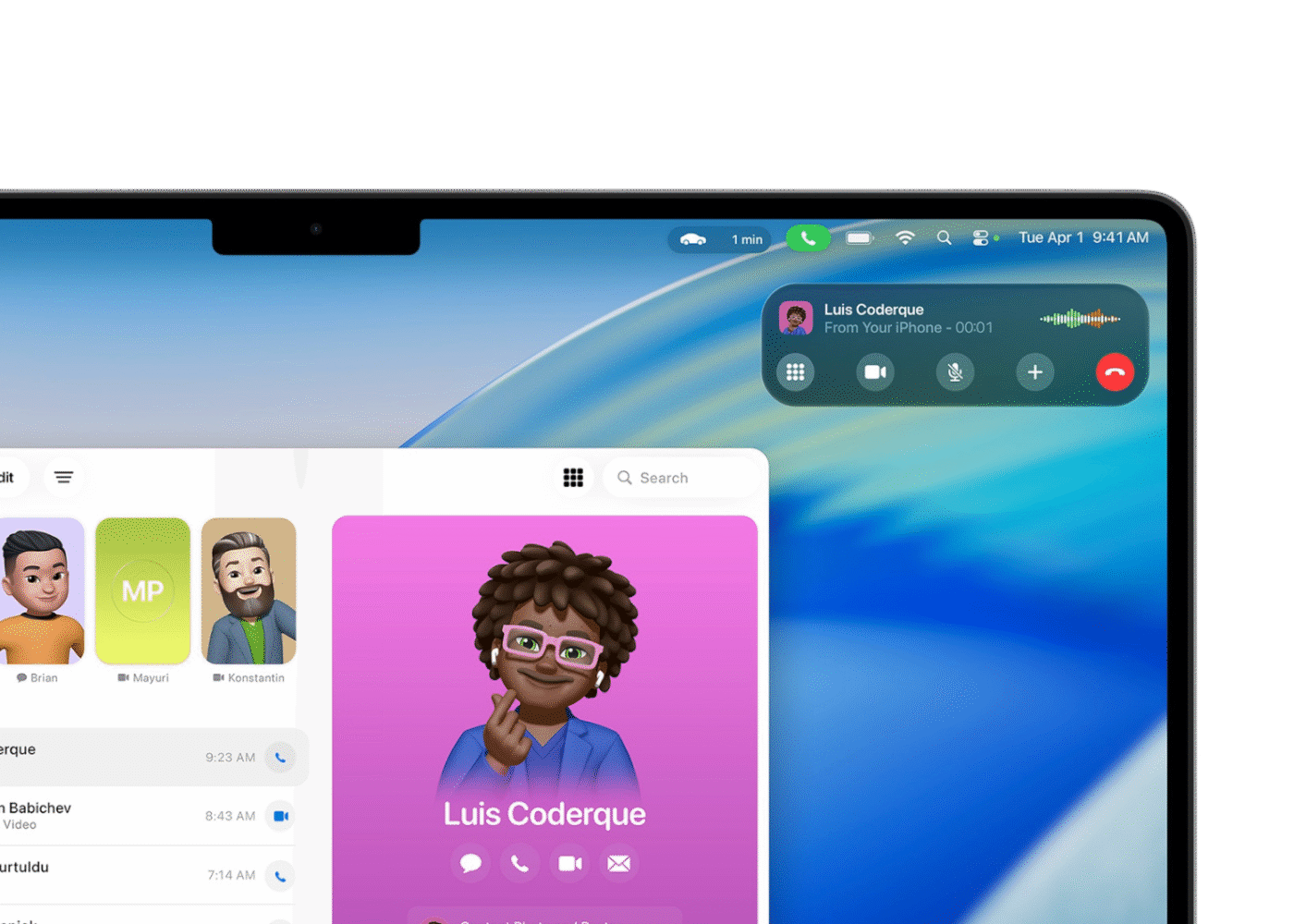
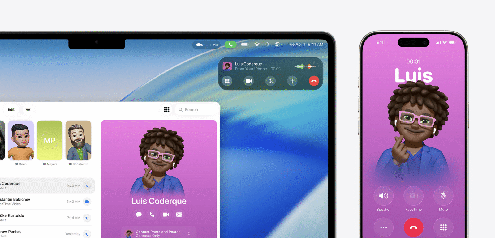
The new Phone app is the obvious highlight. For the first time, I can make and receive calls on my Mac without juggling my iPhone. This isn’t the clunky handoff system of old. It’s seamless, clean, and native. I didn’t realize how much I wanted this until I started using it daily. No more digging for my phone during meetings, no more Bluetooth headset weirdness. Just a clean call interface right on my desktop.
Live Activities also make the jump from iOS, and they fit the Mac like a glove. Watching a package delivery update in real time on my desktop feels futuristic. Tracking sports scores or ride-shares without pulling out my phone is the kind of small convenience that adds up. It’s not flashy, but it makes the Mac feel like part of my real-time life instead of a static workspace.
Continuity Camera, AirDrop, Handoff — all the old tricks are still here, but refined. AirDrop in particular feels faster and more reliable. I used to joke that AirDrop only worked when it felt like it, like some kind of pagan ritual requiring perfect conditions. In Tahoe, it just works. I can finally stop emailing myself photos like it’s 2007.
These features are where Apple’s ecosystem flexes hardest. Windows 11 has made strides with Android integration, but it still feels bolted on. Tahoe’s continuity feels organic, like the devices were designed to live together from the start. Which, of course, they were.
Performance: The Silicon Show
Let’s be real: Tahoe is built for Apple silicon. On my M3 Max with 48 GB of RAM, it’s absurdly smooth. Animations glide, apps launch instantly, multitasking feels effortless. Even under heavy load — dozens of Chrome tabs, Final Cut rendering in the background, Slack and Discord buzzing away — the system doesn’t flinch. This is macOS at its most confident.
The difference on Intel machines is stark. They run Tahoe, but you can feel the strain. Animations hitch, battery life suffers, and the whole experience feels like it’s living on borrowed time. This is the last macOS for Intel, and it shows. If you’re still clinging to that 2019 MacBook Pro, Tahoe is a bittersweet farewell tour.
On Apple silicon, though, it’s glorious. Even in its early days, Tahoe ran smoother than most polished releases. That’s a testament to both the efficiency of Apple’s chips and the maturity of macOS on that hardware. I’ve had fewer crashes, fewer bugs, and fewer slowdowns than I’ve ever had with a major macOS upgrade. It feels road-ready in a way macOS rarely does at launch.
Battery life is also noticeably better. My MacBook Pro lasts hours longer under the same workloads compared to Ventura. Part of that is Apple silicon efficiency, part is software optimization. Either way, it’s a win.
The Rough Edges
For all its polish, Tahoe isn’t perfect. The Liquid Glass aesthetic, as beautiful as it can be, sometimes feels inconsistent. Certain apps nail the look, others clash horribly. Legibility can suffer, especially on bright wallpapers. It’s the kind of thing that reminds you this is version one of a new design language. Big Sur had similar growing pains, and it took a couple of cycles to settle down.
Some features also feel half-baked. The Phone app is fantastic, but why can’t I send texts directly from it? Live Activities are great, but I want more granular control over what appears and where. Spotlight is powerful, but Apple still refuses to let me extend it with third-party plugins. For a company that prides itself on ecosystem, Apple is still weirdly allergic to letting power users customize too much.
And then there’s the Intel situation. Tahoe runs on Intel Macs, but it’s clear those days are numbered. If you’re on an older Mac, this update is both a gift and a goodbye. Apple didn’t abandon you yet, but the writing is on the wall.
Daily Life With Tahoe
The ultimate question is this: does Tahoe make my daily life better? And the answer, surprisingly, is yes. Not just in flashy demo features, but in small, constant ways that add up.
Spotlight has become my command center. Shortcuts automate away the boring parts of my workflow. The Phone app keeps me from juggling devices. Live Activities keep me updated without breaking focus. Even the Liquid Glass aesthetic, for all its quirks, makes my Mac feel modern, alive, and personal again.
I’ve found myself enjoying my Mac more. That sounds cheesy, but it’s true. For years, macOS updates have been functional, safe, even boring. Tahoe is fun. It makes me want to explore, to tinker, to customize. It makes me feel like my Mac is evolving alongside me instead of just keeping the lights on.
Final Verdict
macOS Tahoe 26 is Apple’s boldest macOS release in years. The Liquid Glass design is divisive but refreshing. Spotlight has transformed from a search bar into the beating heart of the Mac. Shortcuts are finally useful instead of ornamental. Continuity has reached new heights, and performance on Apple silicon is flawless. This is the Mac stepping confidently into its next era, even if it leaves Intel behind in the process.
It’s not perfect. The design needs refinement, some features feel unfinished, and the inconsistencies can be jarring. But overall, this is the most exciting I’ve been about macOS in a long, long time.