As someone who gets way too excited about UI layering, blur radii, and color saturation curves, Apple’s upcoming Liquid Glass design language feels like a thrilling moment in the evolution of their interface ecosystem. It’s the kind of high-concept visual shift that immediately sparks discourse—and I mean heated, Reddit-thread-level discourse. And that’s good. It means people care.
First introduced as part of Apple’s sweeping OS 26 updates—coming to iOS, iPadOS, macOS, watchOS, and tvOS—Liquid Glass is being billed as a new foundational look for the Apple ecosystem. Think of it as Apple’s first truly unified design push since the skeuomorphism-to-flat-design jump with iOS 7 in 2013. Only this time, it’s less about visual minimalism and more about depth—literal and metaphorical.
So, what exactly is Liquid Glass?
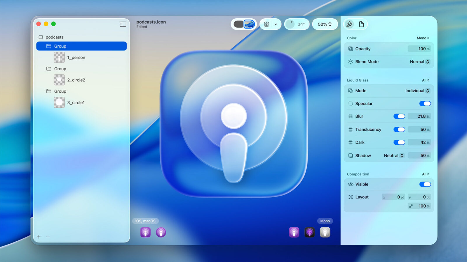
In practice, it’s a highly stylized, translucent UI treatment that aims to evoke the sense of interacting with physical materials—glass, water, fog. Picture UI elements like Control Center, menus, and pop-ups floating above your screen content, as if suspended in sheets of fluid glass. It’s meant to look dynamic, alive, and context-aware. And honestly, in the first beta? It did look like that. It was subtle, futuristic, and for design nerds like me, it hit a sweet spot between sci-fi gloss and tactile realism.
But then the betas kept coming—and things started to blur. Literally.
By Beta 2, Apple introduced heavier blur and contrast tweaks to improve readability (a necessary compromise, let’s be honest). By Beta 3, that glassy clarity gave way to something that looked more like frosted acrylic. It’s more legible, yes. But it also sacrifices some of the fluid brilliance that gave Liquid Glass its identity in the first place.
And that’s where this entire discussion lands: we need control.
The conversation around Liquid Glass so far has been too binary—either it’s too hard to read or it’s too boring. But this isn’t a binary problem. It’s a personalization opportunity.
We need a Liquid Glass Intensity slider.
Let that sink in for a second. Imagine being able to tailor your OS’s translucency like a photo filter: light glass for maximum design flair, heavy frost for pure legibility, or anything in between. Maybe even presets like “Minimal,” “Balanced,” and “Max,” with live previews.
It’s not a new idea either—Apple already lets users toggle display scaling, reduce motion, enable contrast boosts, and fine-tune haptic feedback. So why not extend that level of care to this new design language? This isn’t a gimmick—it’s a practical accessibility feature and a user experience enhancement for those who obsess over aesthetics.
There’s already a working visual vocabulary across the three beta versions. Beta 1 was sleek and sharp, Beta 2 softened things for balance, and Beta 3 went full steam into legibility. Each of those could be offered as a selectable option within Settings > Accessibility > Visual Effects, or as part of a broader theme customization toolkit Apple could (and should) lean into as users increasingly demand control over their devices.
Let’s also talk about why Liquid Glass matters.
This design is Apple’s attempt to unify its entire interface philosophy across form factors. It’s not just visual—it’s functional. With Apple Vision Pro carving a path into spatial computing and the rest of the OS lineup becoming more consistent, Liquid Glass helps tie everything together. It gives visual cohesion across phone, tablet, desktop, and headset. It’s the next step in making Apple’s platforms feel less like isolated devices and more like different windows into the same ecosystem.
But if Liquid Glass is the future—and I believe it is—then it needs to be flexible enough to fit into your daily life, not just Apple’s mood board.
Power users want polish and performance. We want a UI that feels premium and alive, but not at the cost of basic function. Beta 3 might be more readable, but it also looks like a downgrade if you loved the clean layering of Beta 1. That trade-off doesn’t need to exist if we’re given control.
And let’s not forget: modern users have grown more design-savvy. We’re no longer in the era where UI changes must be locked behind one fixed choice. From Android themes to Windows glass blur settings to the customization-rich watchOS faces, users increasingly expect to participate in shaping their device’s aesthetic. If Apple really wants to double down on personalization—and they clearly do—Liquid Glass is the perfect place to start treating visual settings more like user-selectable layers than immovable defaults.
Yes, I get that Apple leans on consistency and restraint. But this isn’t about breaking design language—it’s about extending it.
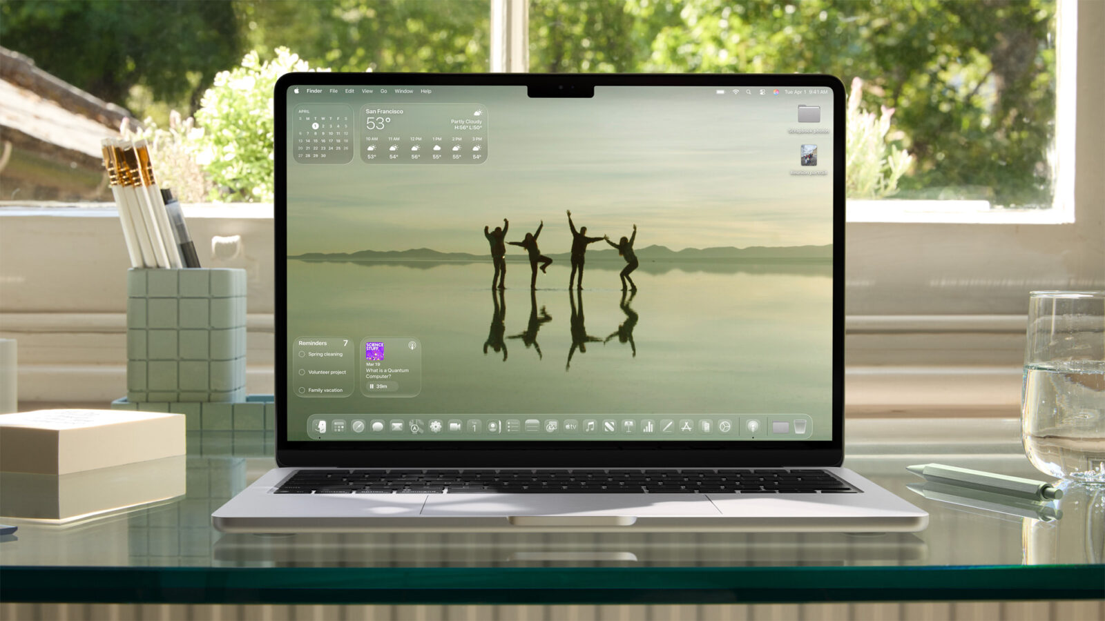
Let us interact with Liquid Glass the way we interact with our environments. Give us the ability to tune how much we see through the interface. Let us dial the blur, amplify the vibrance, or scale the translucency. Accessibility folks will benefit. Aesthetic lovers will benefit. And Apple will reinforce its vision as a company that leads with human-centric design.
We’re still early in the beta cycle, and if Apple’s pattern holds, there will be at least two or three more rounds of design iteration before launch. That means there’s time. Time to move beyond guesswork and make Liquid Glass truly adaptive—not just to lighting conditions, but to people.


