
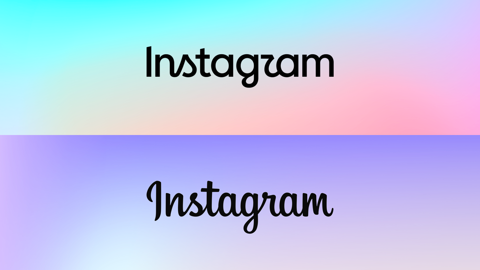
Instagram is giving one of the most familiar parts of its interface a makeover, replacing the handwritten-style wordmark that has appeared at the top of the app for roughly a decade.
Instagram head Adam Mosseri revealed the updated design, describing it as a cleaner and more modern interpretation of the company’s existing visual identity. The new Instagram logo retains some of the flowing characteristics of the previous script, but simplifies the lettering and moves away from an entirely cursive appearance.
It is a relatively small change compared with the dramatic redesign Instagram introduced in 2016, when the company replaced its detailed retro camera icon with the colorful gradient symbol that remains closely associated with the platform today. This time, Instagram is adjusting the accompanying wordmark rather than reinventing its main app icon.
That does not mean the internet has ignored it. Early reactions have been predictably mixed, with some users questioning whether a redesign was necessary at all. Others have focused on the shape of individual letters, particularly the “r,” which has led to jokes that the new wordmark looks more like “Instagzam” than Instagram.
Such reactions are hardly unusual when a major platform changes a visual element people have seen almost every day for years. Logos and wordmarks can become part of the background of using an app, which means even relatively minor adjustments tend to look unusually noticeable at first.
Instagram says the broader visual refresh has been designed to evolve alongside the platform and its creators. That explanation reflects how different today’s Instagram is from the service represented by its earlier branding. What began primarily as a photo-sharing app has expanded into short-form video through Reels, private messaging, shopping, creator tools and an increasingly algorithm-driven content feed.
The challenge for Instagram is maintaining an identity that remains recognizable while accommodating a product that keeps expanding. Simplified branding has become common across technology companies partly because visual systems now need to work across phones, websites, advertisements and a growing collection of connected services. Cleaner designs can be easier to adapt, though they can also remove some of the personality that made older branding distinctive.
There is no practical change for Instagram users attached to the redesign. The app will work exactly as before, and nobody needs to update how they interact with it simply because the lettering at the top looks different.
Instagram plans to introduce the new wordmark globally over the remainder of 2026 and beyond, so users may encounter the redesign at different times depending on their account or region.
Whether the new Instagram logo eventually feels natural will probably depend less on its typography than on familiarity. Ten years is a long time to stare at the same piece of branding, and replacing it was always going to make some people wonder why anything needed changing in the first place.